Source: ReturnPath
We live and breathe email. From headers to footers, we’re kind of obsessed. And although email is our business from a product perspective, we also use email marketing programs for our sales and marketing efforts.
One of the things we regularly send is our customer, prospect, and partner newsletter. We customize the content for each audience and deliver it straight to inboxes every two weeks. Since moving Email Service Providers (ESPs) almost a year ago, we’re now in a good place to do more of the stuff we love—like A/B testing. We like to test new and sometimes strange ideas to measure how they perform.
Preheader text is one item we’ve been thinking about lately. In many email clients, and especially on mobile devices, it’s nestled under the subject line. It’s another way to persuade your subscriber to open your email—and we love a clever preheader!
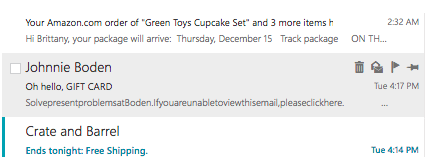
We’ve noticed lately that some brands have been removing spaces in the preheader text of emails. Here’s an example from Duluth Trading Company.

The email itself features a regular preheader, but the text in the preview of the email client (Outlook, in this case), has had the spaces removed.

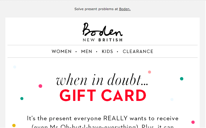
Boden is another example.


So, why would companies do this? It’s all about real estate. Preheaders show between 35 and 140 characters depending on device, email client, and window size. Removing spaces can add more words, giving you room to add more of a compelling story for your subscriber. Campaign Monitor has a good explanation all about preheaders if you’re looking for more information.
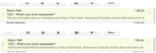
So this month, we tried A/B testing our preheader to see if it had an effect on performance. We thought that removing all spacing in the preheader text would increase the open and read rates of our email because it gave us more space to work with—and it’s something different.

The results were about dead even. The regular preheader performed slightly better (higher opens and a higher read rate)—but by less than a percentage point better than the truncated preheader. We saw that click throughs after opening were slightly different between the two emails, too, but again, by less than a percentage point. Another measure, unsubscribes, was also in a dead heat, with less than two tenths of a percentage difference.
Moving forward, truncated headers aren’t something we’ll use regularly, unless we have a reason. We will, however, be trying things regularly to see how they perform! If you have a suggestion or idea, please let us know by using the comment section below. We welcome your feedback and look forward to reporting on the results of our next test.
To subscribe to the Return Path newsletter, visit our website.

