As we reach the halfway point for 2021, there is a lot to celebrate and be mindful of. June embraces a number of celebrations and milestones—Pride Month, Juneteenth, and Father’s Day—which offer marketers plenty of content inspiration and give brands the opportunity to exercise unity, compassion, and empathy.
Whether it was a June celebration, an eye-catching subject line, practical content, or knock-out visual design, read on to find out what caught the eye of Litmus’ team members this month.
Jess Materna, Senior Product Marketing Manager
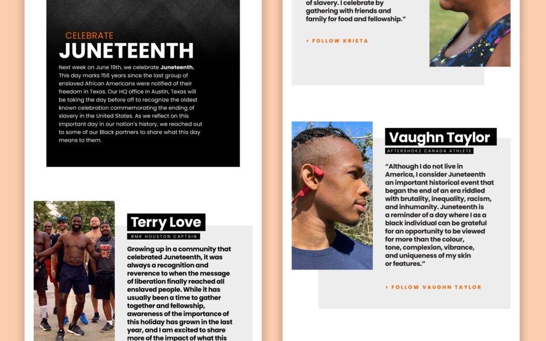
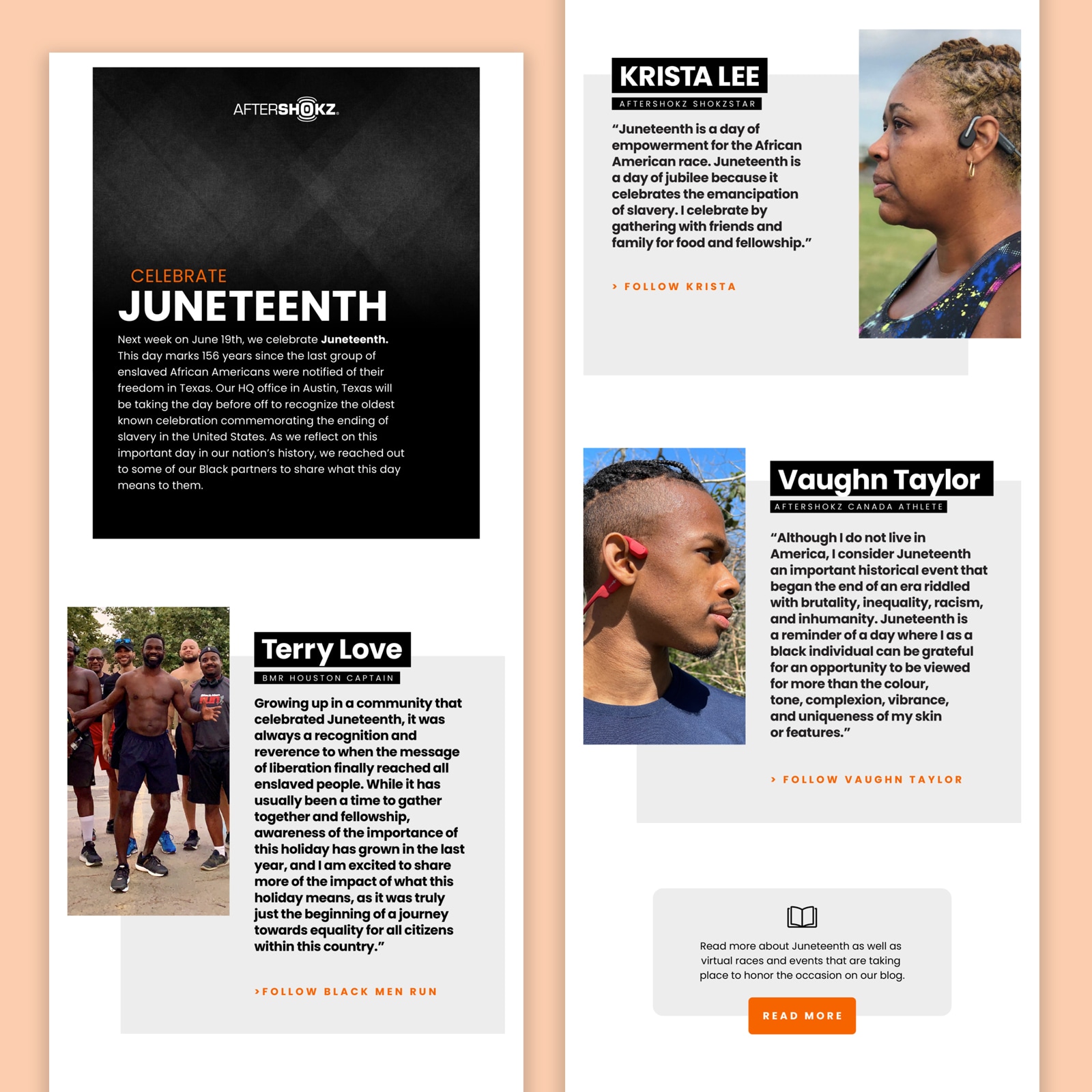
Aftershokz
Subject line: What Juneteenth Means to Black ShokzSquad Members
Preview text: Celebrate Juneteenth With Us
Jess says: “I like that this email had a dedicated purpose; to share the company’s commitment to honoring Juneteenth and elevating the voices and visibility of the Black community. I appreciate that they included a link to follow each individual who took the time to contribute a quote about what Juneteenth means for them; helping them grow their following helps amplify their voices long after this email has been sent. I also appreciate how they kept the product out of this email as it helped to keep the focus where it should be.”
My thoughts?
The content of this email is fantastic. This brand has used its email marketing channel to educate subscribers about this historical day and be transparent about its values. The Z-pattern layout helps draw the reader’s eye down the email, and off-grid placement of headlines and imagery also help to retain engagement.
As someone who isn’t dependent upon a screen reader, I draw a huge amount of value from the content. Unfortunately, this all-image email doesn’t use the ALT tags well: Instead of echoing the content of the images, each ALT text encourages click throughs to Instagram content, meaning the value I get can’t be enjoyed by everyone. 
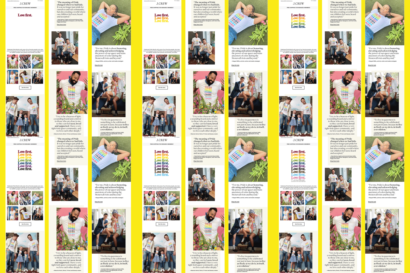
J.Crew
Subject line: Love First 
Preview text: Celebrate LGBTQ+ Pride Month with us
Jess says: “I love the engaging, building GIF at the top of the email that draws the reader into the main email content. As you scroll down, you realize that GIF is actually the featured design on their line of Pride Month merch, and they make sure to call out the awesome organization they’re supporting. The mix of static photos and GIFs throughout the rest of the email layered with quotes from members of the LGBTQ+ community was a brilliant and balanced way to showcase their collection while keeping it authentic.”
My thoughts?
Like many retail brands, J.Crew will benefit a great deal from using live text rather than image-only compositions. This will help them to reach a wider audience, and tap into even more revenue potential. You can test how accessible your emails are using Litmus’ QA tools.
Magan Le, Content Marketing Manager
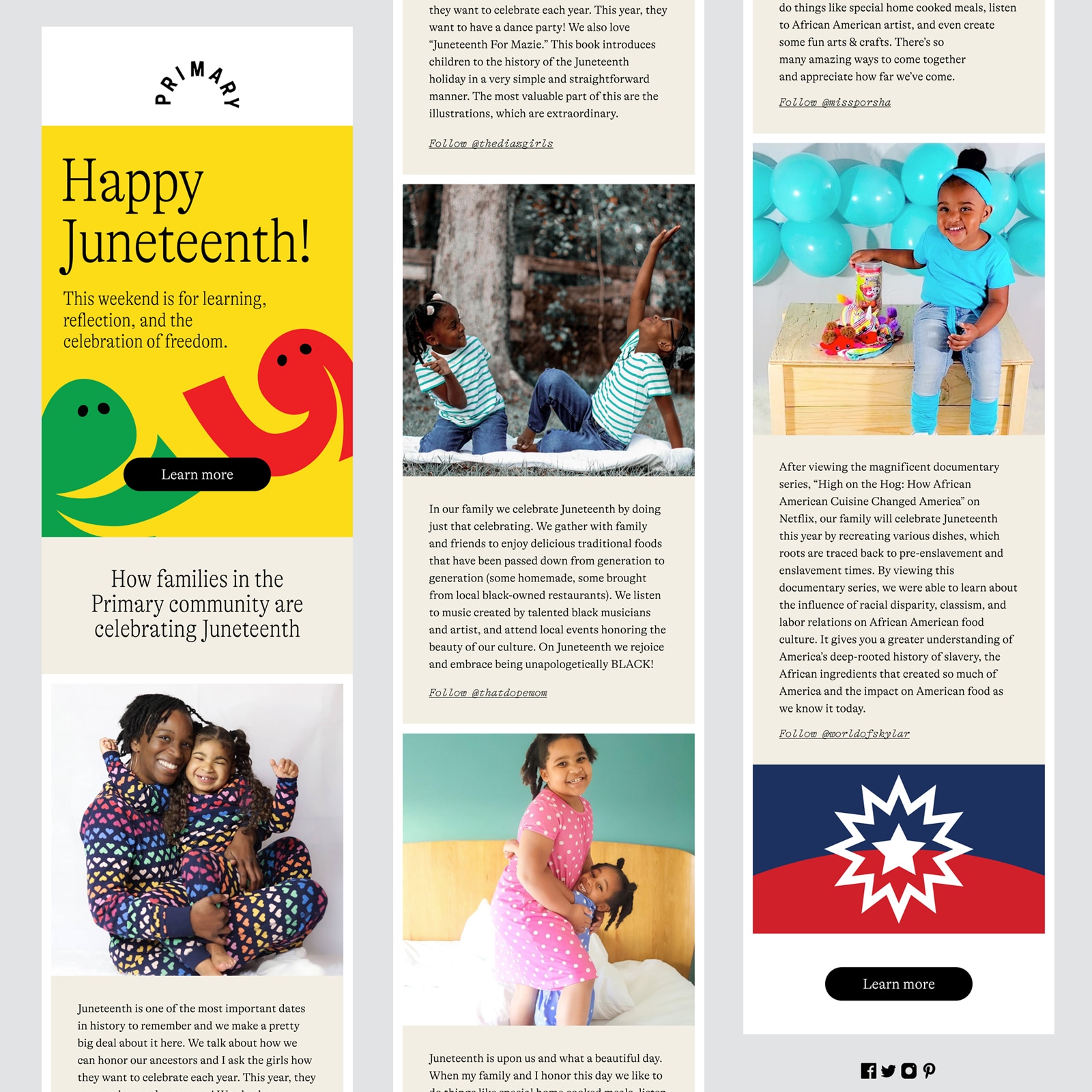
Primary
Subject line: Celebrating Juneteenth tomorrow
Preview text: A day to learn, grow, and reflect.
Magan says: “Primary gets to the point about the intention of Juneteenth—learning and growing—and then leading subscribers to a blog post that educates folks about the holiday. And instead of tooting their own horn, they amplify the voices of the Black community. I love this, especially coming from a children’s brand.”
My thoughts?
Primary has a very fun and vibrant brand identity, not a bad idea considering their target audience. And it’s their audience that they are putting front and center in this beautifully crafted email celebrating Juneteenth. Blocks of bold color and beautiful, natural photography, with a cohesive journey from email to web are all part of what makes this an inspirational email.
This is another example of an email that could benefit from using live text for written content. Although Primary has ensured that the copy within images is echoed in the ALT tags, all-image emails don’t offer an accessible experience for people who rely upon reading aids such as screen magnifying apps. Image-based text won’t enlarge gracefully and will appear blurry when zoomed. Live text is the only way to ensure your email can be read by everyone.
For more accessibility tips, check out our Ultimate Guide to Email Accessibility.
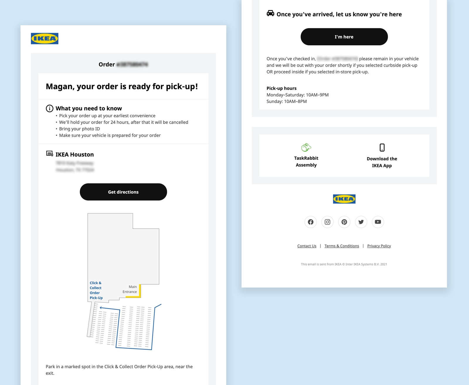
IKEA
Subject line: Your IKEA order is ready for pick-up!
Preview text: Your order is ready for pick-up from IKEA, we’ll see you soon! Here’s what you need to know
Magan says: “Transactional emails don’t get a lot of love, so I’ve got to shout out to one of IKEA’s. Is it drop-dead gorgeous? No. But, it’s clean and simple and tells me exactly what I need to know to pick up my order at the store. What I appreciate most is the map so I know where I should park. This flowed seamlessly into the offline experience as there were also perfectly placed signs in the parking lot with arrows navigating me toward the Click & Collect Pick-Up area. No driving around aimlessly wondering where the heck I’m supposed to be.”
Nicole Swift, Customer Support Manager
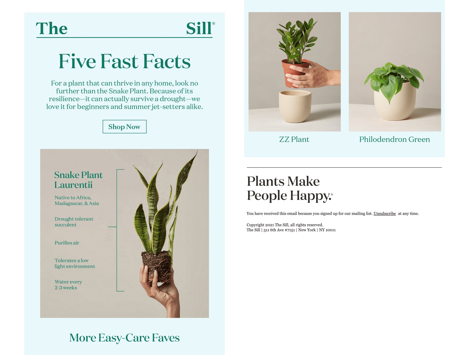
The Sill
Subject line: The ultimate easy-care plant 
Preview text: It’s air-purifying *and* vacation-friendly, too!
Nicole says: “I love the quick and informative facts and how they were displayed. Plus, who doesn’t want a plant that will thrive even while you’re on a summer vacation?”
My thoughts?
This is a great example of visual design leading the eye down an email. The left hand placement of stacked facts works well with natural reading patterns, making this email highly scannable. The typography-led retro styling and two-tone color scheme are visually appealing and on-brand, making this a cohesive journey from email to web.
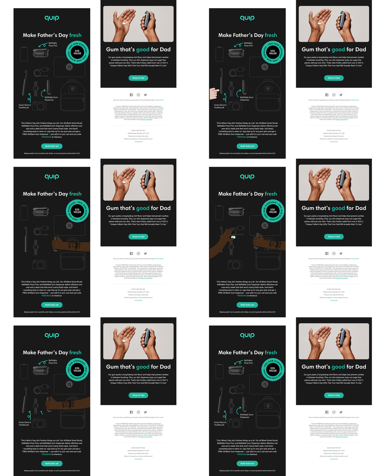
Quip
Subject line: Free All-Black Gum Dispenser for Dad 

Preview text: Fresh breath. Same stale Dad jokes.
Nicole says: “That GIF at the top is so sleek and cool!”
My thoughts?
I agree, the hero animated GIF is super eye-catching and is an impactful way to showcase relevant products as soon as the email is opened. The subject line highlights Quip’s offer, enticing readers to open, with an amusing preview text that will be relatable to a good portion of their audience.
Live text makes this email accessible to a wider audience. Further accessibility considerations would be to left-align paragraphs of copy that exceed three lines and creating a light mode experience that can support readers who benefit from a light contrast reading experience.
Lily Worth, Email Design and Production Specialist
Hi, that’s me! There are two emails from my inbox that I really liked, A Kids Book About and Blush.
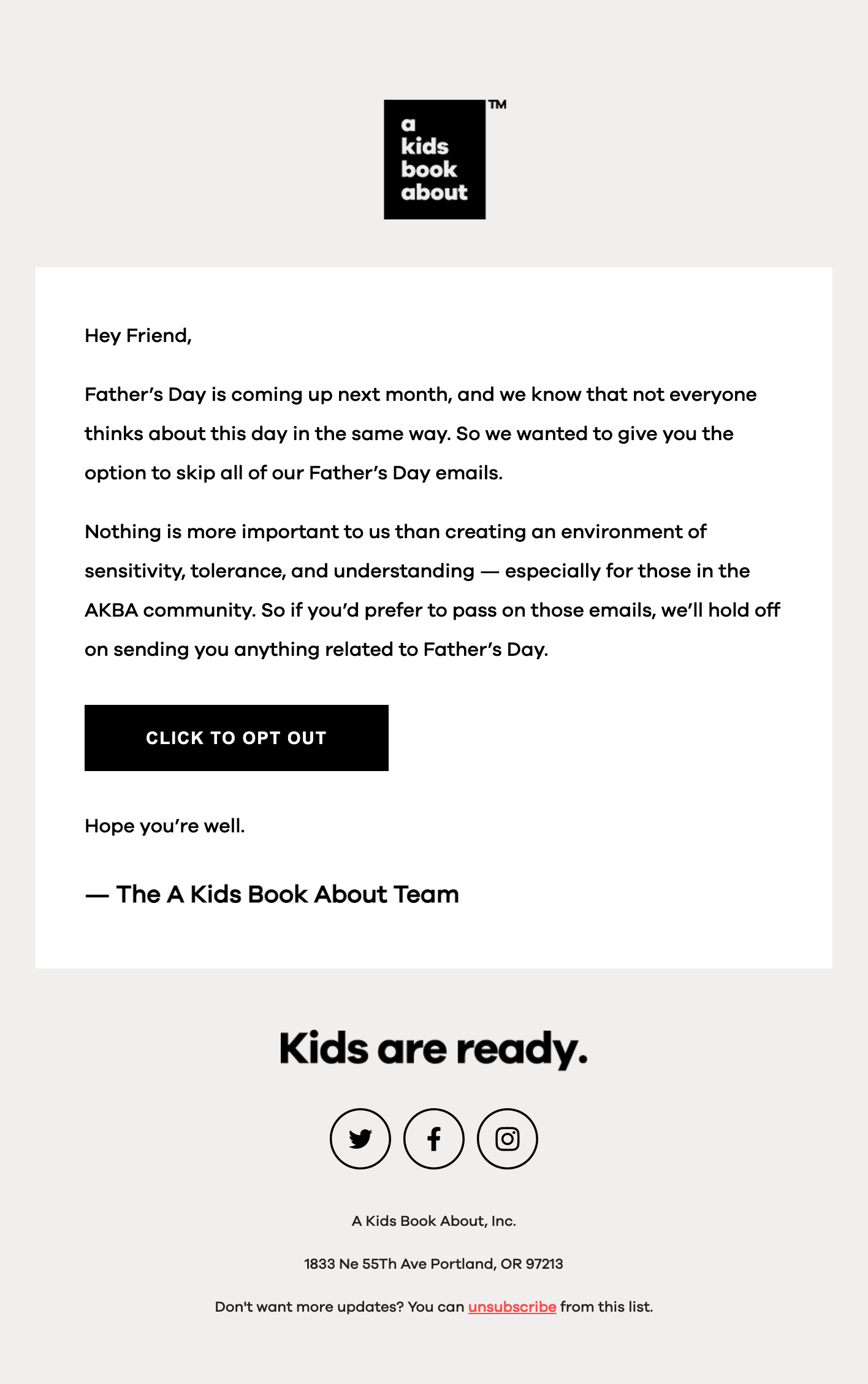
A Kids Book About
Subject line: Friend, do you have a sec?
Preview text: [none]
What if some of your readership won’t find Father’s Day content relatable? What if such content could cause distress? Let them opt out.
When it comes to celebrations such as Mother’s or Father’s Day, offering subscribers the opportunity to opt out shows a brand’s human side and empowers readers to skip content they may not wish to receive. Because empathy wins in email marketing. This year, I have received numerous opt-out emails in my inbox, which elevates my trust in the senders, as they have mine and other readers’ best interests at heart.
This example from A Kids Book About is short, simple, and to the point. Their no-frills, text-only approach shows just how much they care about their readership.
Blush
Subject line: Say hello to your new Palz!
Preview text: [none]
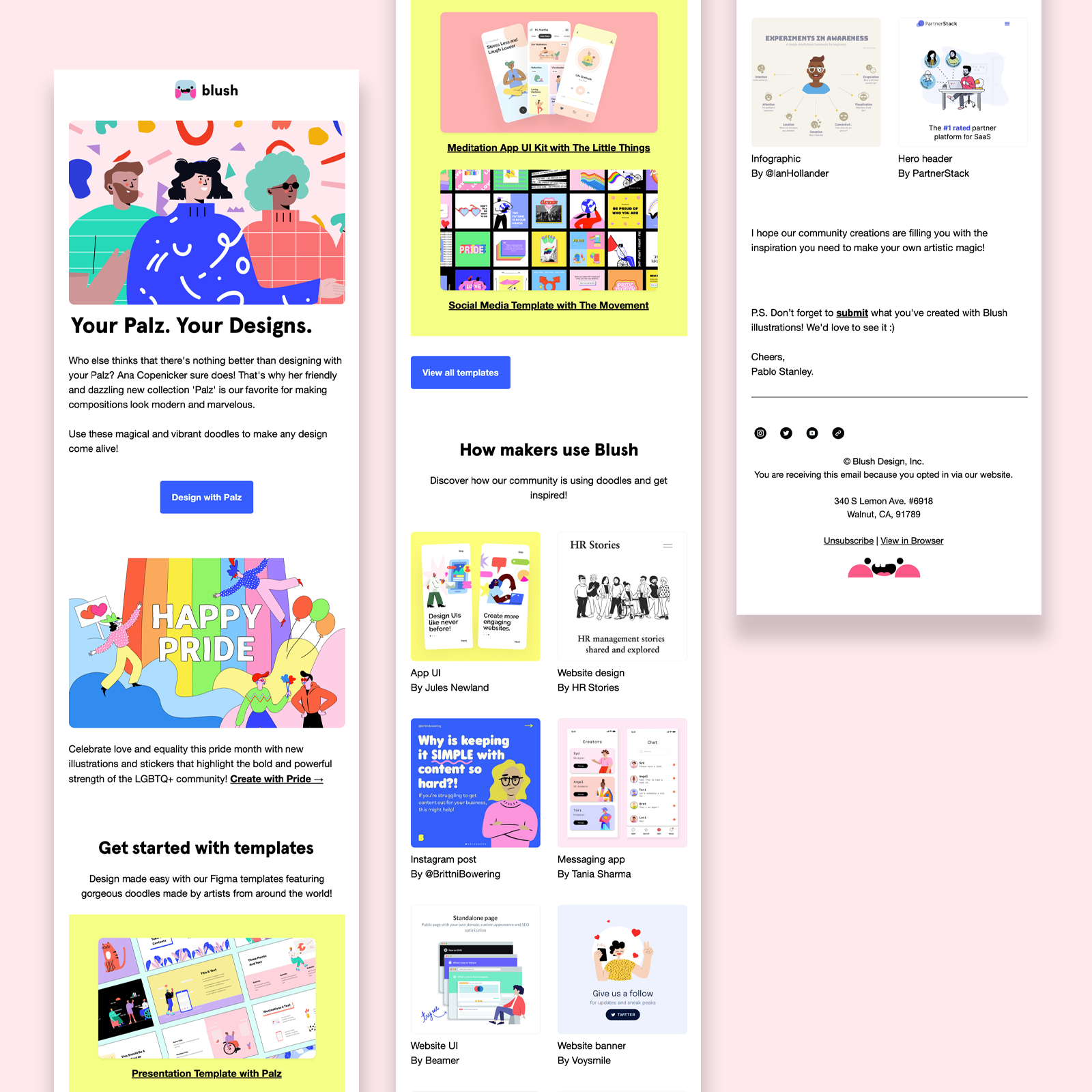
Back in May, Blush started to talk about Pride Month, showcasing a beautiful set of illustrations that centered around this celebration. Not only did they promote and celebrate through their email channel, they also created a cohesive social campaign. They then stood firm by including this content in consecutive email campaigns, like this one.
The bold colors against negative space and a clear understanding of content hierarchy make Blush an inbox favourite of mine. If you would like a little more of Blush in your life check out their fantastic blog full of inspiring, inclusive, and creative content.
Utilising the preview text area is the one thing that could elevate Blush’s campaigns and newsletters to even greater heights.
Kimberly Huang, Content Marketing Specialist
Spotify
Subject line: See how your listening stays fresh.
Preview text: Only you can change up the vibe like that.
Kim says: “I got this email shortly after participating in an in-app experience on Spotify that launched in early June. The personalization, animated GIF, copy, and overall simplicity work well here. And the cherry on top? The timing! Arguably, this email didn’t need to be sent to make a splash about the campaign—I saw a lot of noise about this on socials and didn’t expect Spotify to bring the experience over to email. But they did! Getting this in my inbox a few hours later was a pure delight. And, it made me jump back on the app to listen.
Additionally, when it comes to using your data to create delightful experiences, Spotify never disappoints. The overall messaging of the campaign—’Only you can change up the vibe like that’— was a fresh take on data and really stood out to me as a preview text.”
We shared ours—so share yours!
What emails caught your attention in June? We want to know! We love hearing from our email community and want to see the ones that stood out to you.
The post The Litmus Team’s Favorite Emails of June 2021 appeared first on Litmus.
![]()

