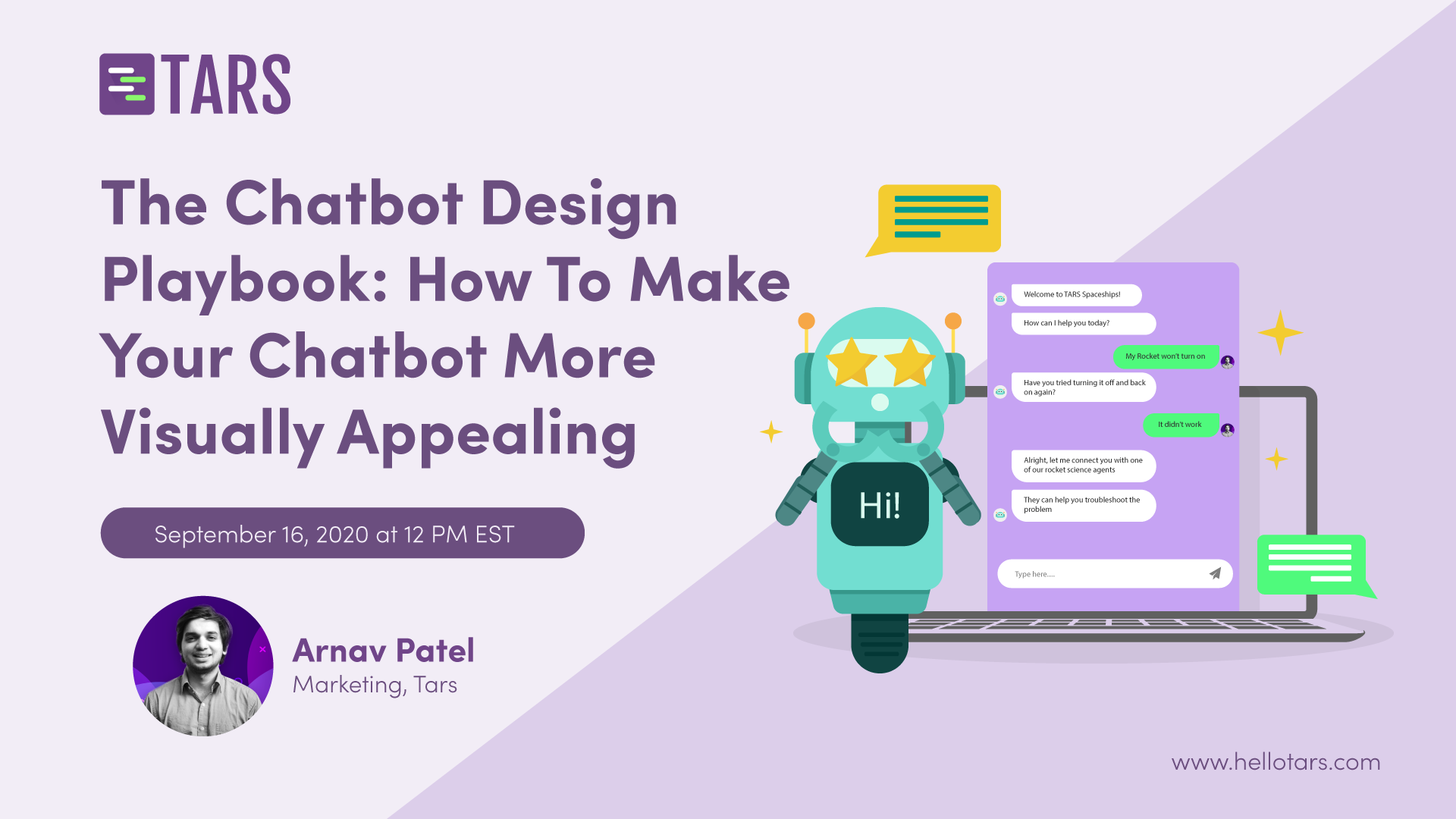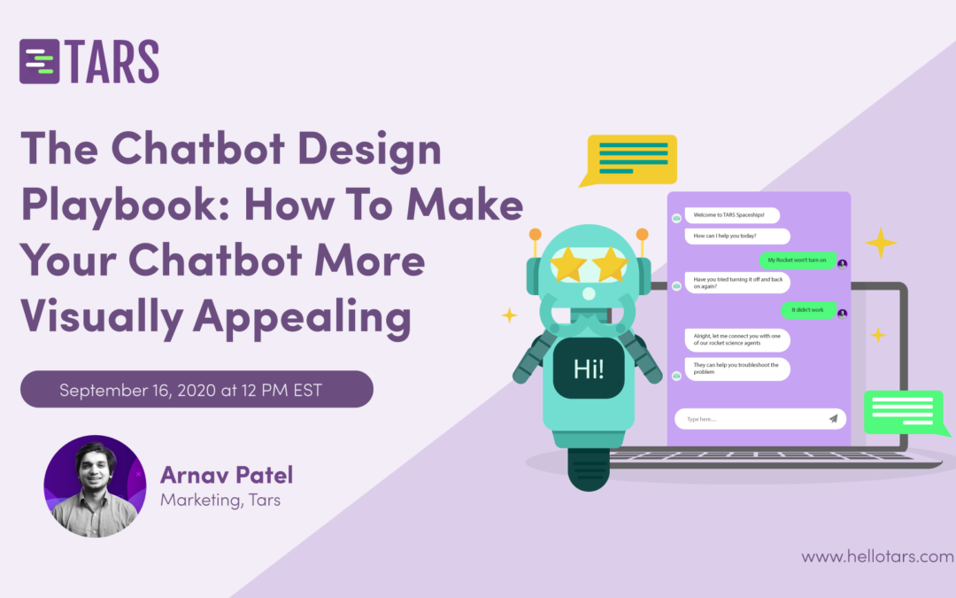
Even though chatbots depend primarily on text, images, and video to communicate with users, they are at the end of the day user interfaces comprised of visual elements on the page (the message bubbles, user input, etc.) These basic elements that constitute the chatbot need look the part in your marketing campaign for one simple reason?? Coherence. Just like with any other piece of content that you put out, your chatbot is a representation of your company. A big part of being an accurate representation is fitting in with the visual aesthetic of the rest of your branding? If all of your webpages, brochures, blog posts, and videos use red and yellow heavily (because those are your brand colors) but your chatbot has a green and blue theme, the bot is not going to look like it is a part of your company. This lack of coherence will undercut your legitimacy, make brand recall difficult, and generally hamper your ability to generate leads. So, we’re hosting a webinar this Wednesday[09/16] at 12 PM EST to discuss the importance of making your bot look the part visually so that you have brand coherence in your marketing campaigns? Join this chatbot designing webinar and learn how to create chatbots that are more visually appealing?

