With one very disruptive year almost behind us, it’s time to look to the future of email design and see which trends will be setting our inboxes alight in the coming year.
Early predictions in the design world suggest that the chaos we have endured could be reflected with disharmonious, maximalist design styles. Are we likely to follow suit in email? Or will the inbox be a place of tranquility, with a minimalist aesthetic continuing its reign?
Here are the email design trends we’re expecting in 2021 with examples (click to jump ahead):
- Tangible visual content
- Nostalgia and futurism
- Simplification
- Subtle delights
- Shapes
- Representation and values
- Balancing styles
Tangible visual content
3D imagery proved a hit across the design world in 2020. We see this trend flourishing as we move into 2021 and brands seek ways to showcase their products in the inbox.
With shopping online proving a necessity, offering detail through tangible imagery helps consumers to experience a potential purchase—without having to head to a store.
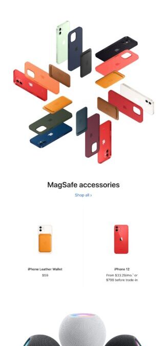
Apple
Apple has been harnessing this style of photography for a number of years, giving customers a virtual experience of their products in email and on the web. This seasonal scroll experience is a great example of 3D product photography that demands exploration.
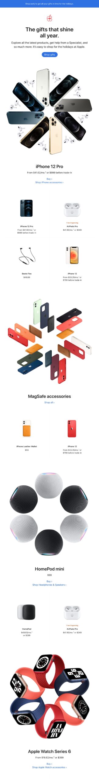
Google Store
Bringing some interactivity to product photography like this exciting example from Google Store is a great way to encourage subscribers to explore the product in more detail and consider product variations.
 Source: Really Good Emails
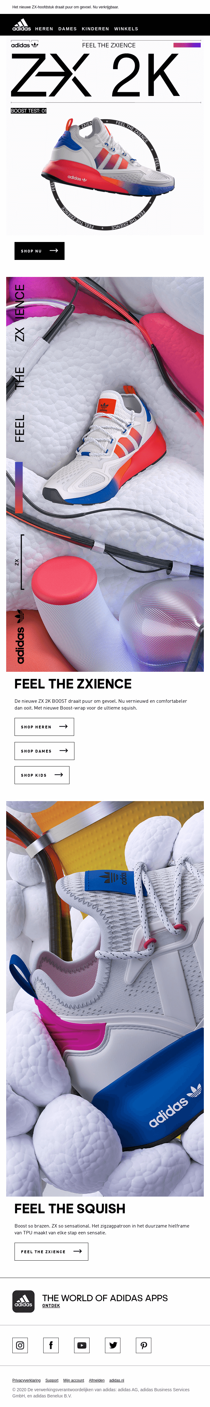
Adidas
Adidas takes tangibility a step further with macro imagery in which you can see small details such as stitching. The product is presented as modern and ahead of the curve with futuristic design elements including typography and abstract forms.
 Source: Really Good Emails
Nostalgia and futurism
Harnessing styles from different eras is another continuing trend. However, this has been slower to take hold in the inbox than in other areas of design…until now.
There are many past eras of design that can be leveraged, but we expect to see serif fonts, keylined shapes, fonts and containers, off-print techniques, and solid drop shadows getting more airtime in our inboxes.
Futurism is often applied using bright colors, outer glows, dark backgrounds, and space themes. However, as we don’t yet know what the future holds, it’s open to interpretation and can therefore be a great trend to experiment with.
Implementing styles that evoke nostalgia, or look to a positive future, will not only make email campaigns eye-catching and aesthetically pleasing but also likely trigger positive emotions, bringing comfort and igniting a subscriber’s imagination.
In other areas of design, it is predicted that retro futurism—a fusion of both nostalgia and futurism—will also be popular. We can’t wait to see examples of this treatment in next year’s email compositions.
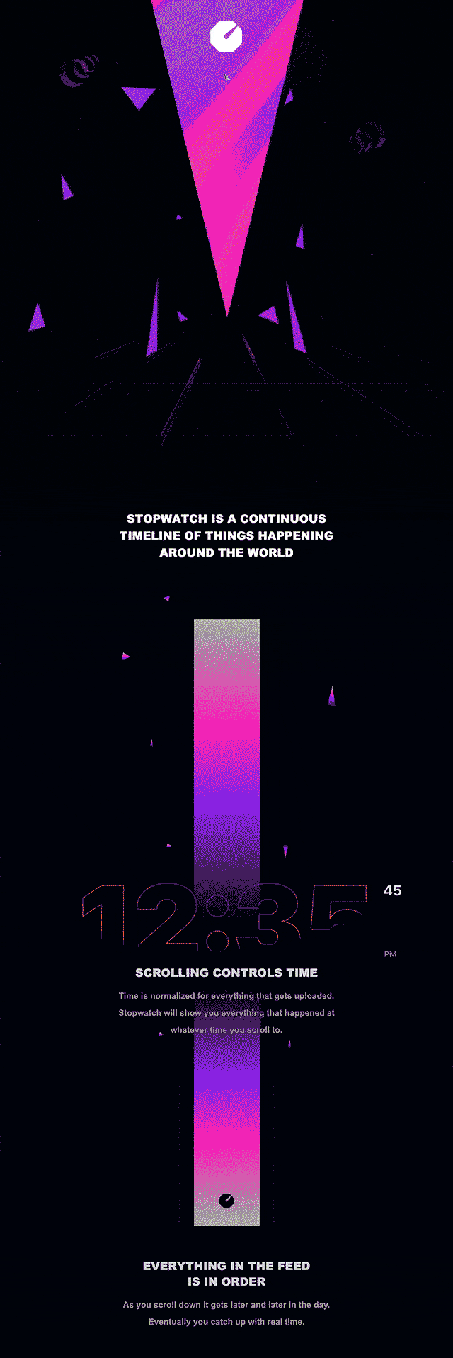
Stopwatch
Stopwatch introduces their product in beta with this pre-launch email. The futuristic styling highlights their offering, a continuous timeline of things happening around the world that always starts with the present moment, and scrolls back through time. Giving a sense of the future in their email design lends a modern “finger on the pulse” aesthetic.
 Source: Email Love
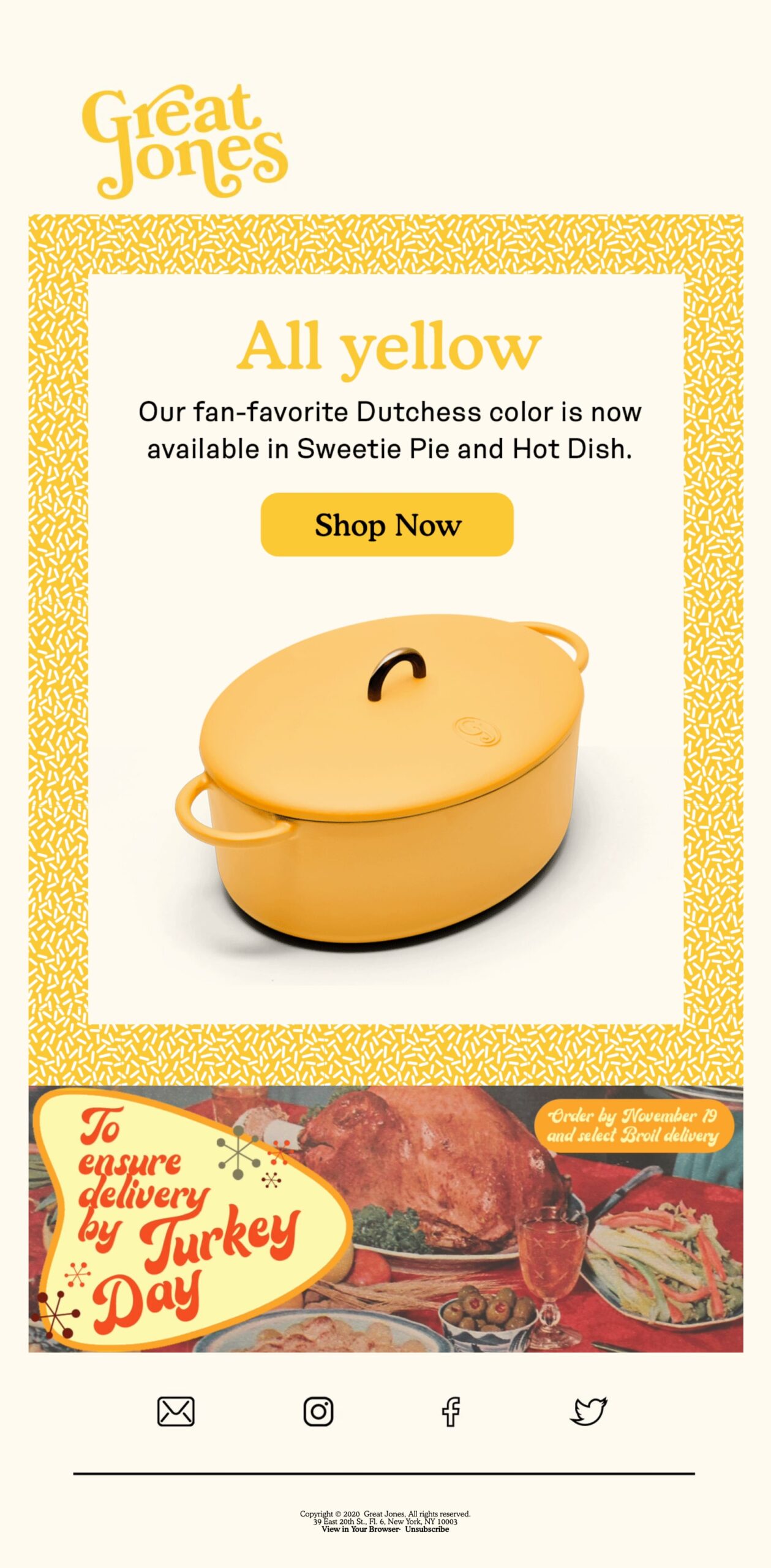
Great Jones
Cookware creators Great Jones have taken the design of vintage recipe books as inspiration for their brand style, which they seamlessly leverage in their email designs with a serif font, retro shapes, and de-saturated food imagery.
Simplification
In contrast to trend predictions in other areas of design, it’s likely that we will see email designers continue to harness the power of minimalism. The volume of emails being deployed is increasing, so keeping things clean and concise means that your message is more likely to be heard in the sea of noise.
Instead of multiple or intense colors and brutalist abstractions, we are likely to see brands lean into stripped back color palettes, muted colors, simplified compositions, and more generous spacing—bringing calm and clarity to the inbox.
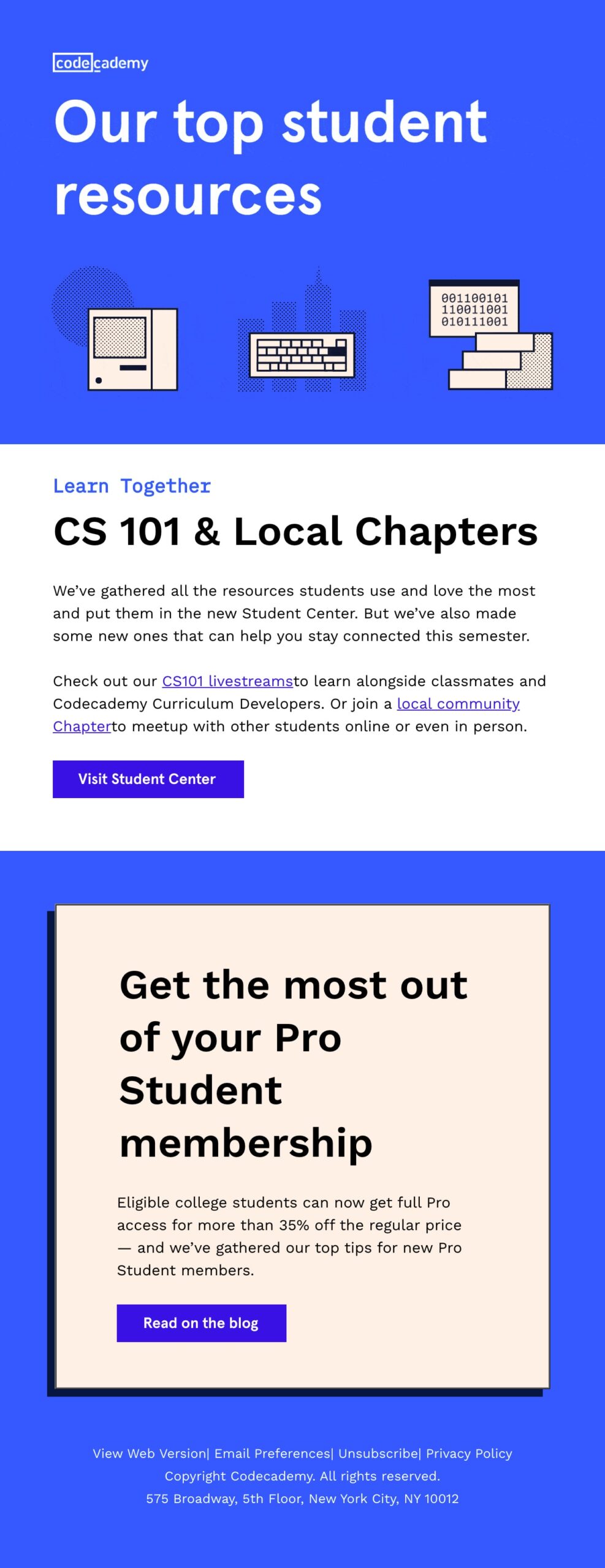
Codecademy
Digital learning platform Codecademy has applied a number of minimalist techniques to this customer email including a limited color palette, generous spacing and line heights, subtle animation, and simplified icons.
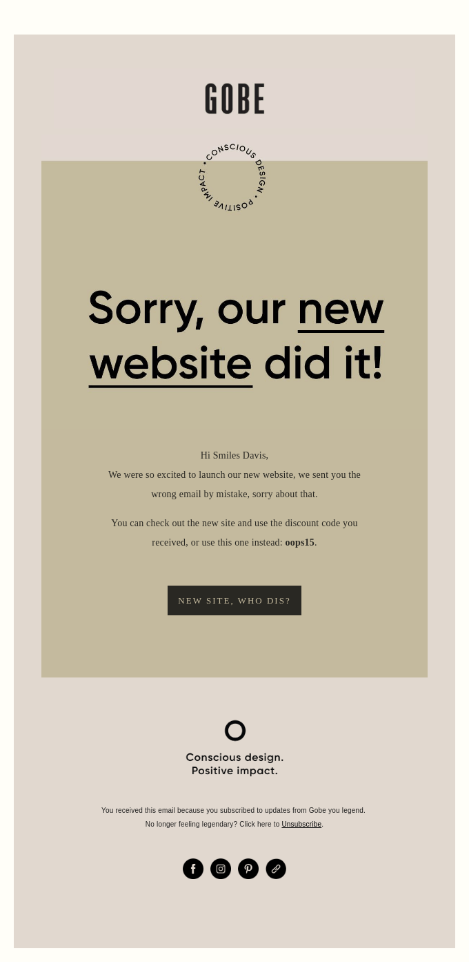
Gobe
Camera accessories brand Gobe uses muted and flat colors in this apology email. Ample negative space allows the reader to quickly digest the message, grab the discount code, and head straight to their new—and seemingly mischievous—website.
 Source: Really Good Emails
Subtle delights
The trend to delight subscribers will continue into 2021. The difference, though, will be in their simplified treatment and subtle application, such as animations and abstractions being used to accentuate and complement messaging rather than as a creative focal point.
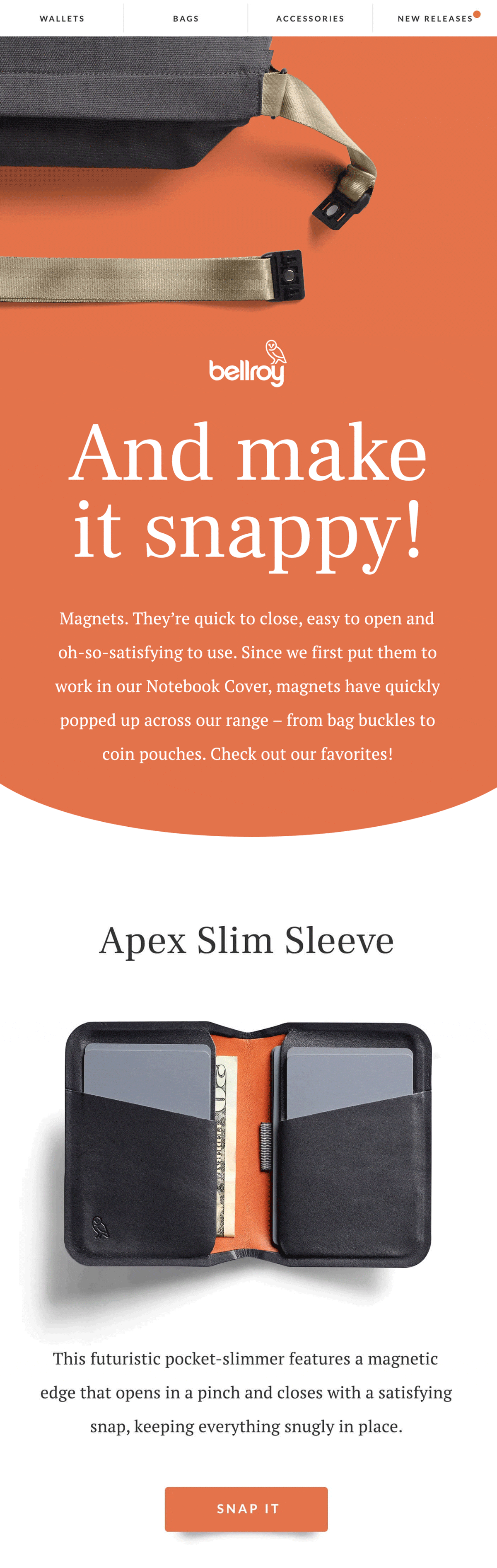
Bellroy
Accessories retailer Bellroy gives a great intro to this promotional scroll experience, showing off their magnetic clasps with this simple four-frame animation.
 Source: Email Love
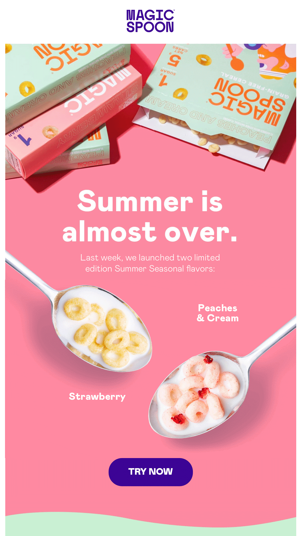
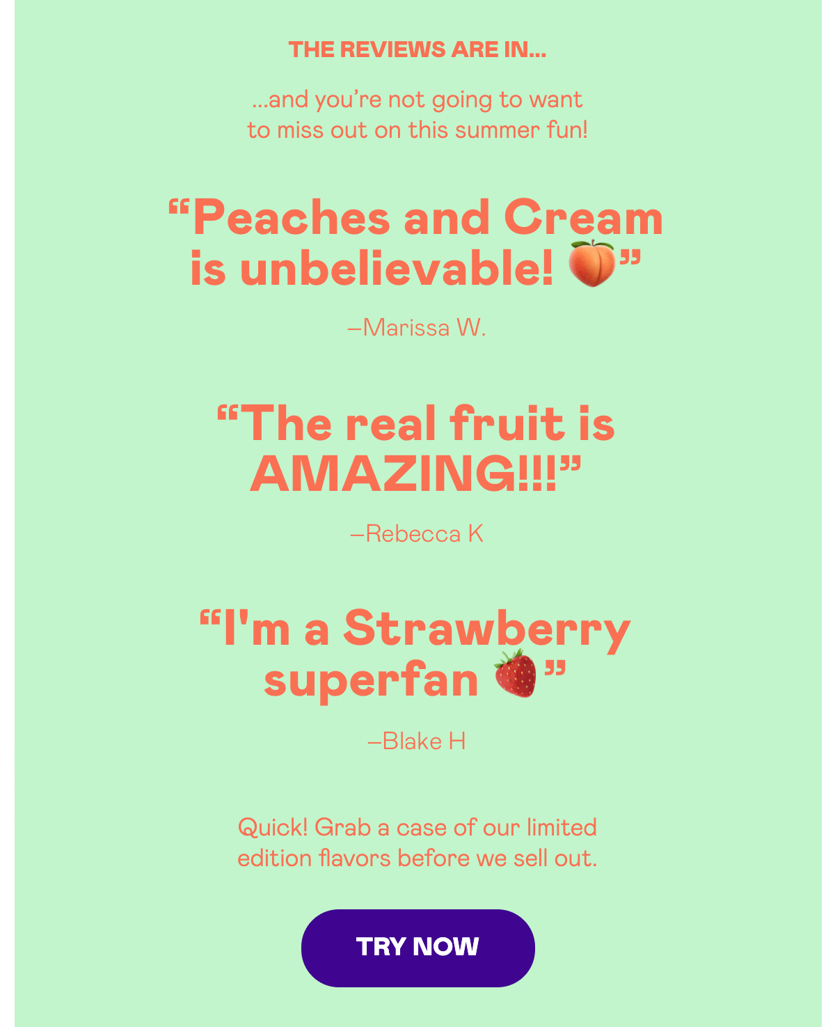
Magic Spoon
Magic Spoon uses simple line animation to highlight parts of the email that they would like to draw your eye to, such as the two time-sensitive flavors they are promoting and key words in customer testimonials. The simplicity of these animations makes them blend in beautifully and not demand all of your precious attention.
Shapes
Organic and geometric shapes will continue to be leveraged in email design. However, we will see more examples of shapes taking up substantial real estate as the only visual content in a composition. This approach is great for reducing cognitive load, as the imagery doesn’t need to be studied by the subscriber. Instead, subscribers are presented with an artistic aesthetic—and more capacity to consume the written content.
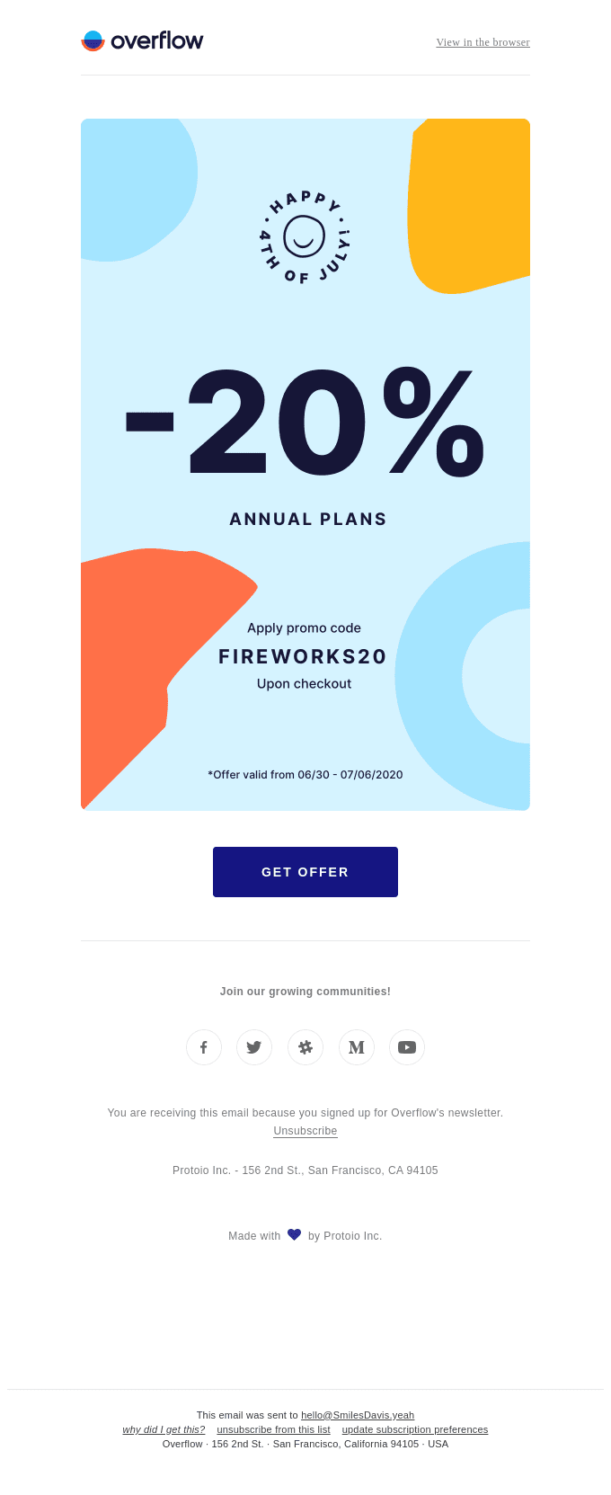
Overflow
Product design software Overflow uses shapes to highlight the messaging around their promotional offer, bringing additional color and framing the key information.
 Source: Really Good Emails
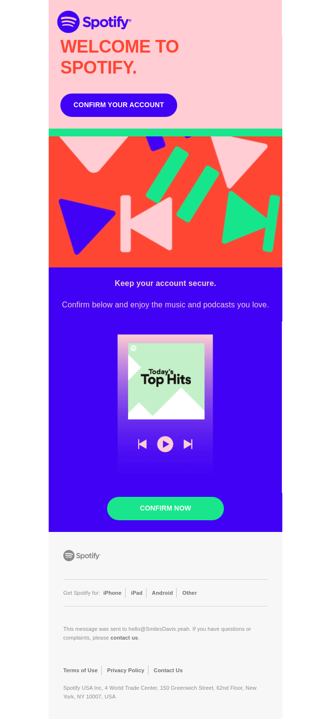
Spotify
Spotify uses the shapes we are accustomed to seeing when streaming music or video as the hero graphic for this welcome email. Although these are identifiable, functional shapes, the simplicity of their application allows them to offer decoration and color rather than an image to engage with and study.
 Source: Really Good Emails
Representation and values
2020 has been an incredibly important year. It has helped us all to take a hard look at issues such as racism and equality and consider whether we are representing all of our subscribers and community or falling short in our representation.
As we bring these crucial conversations to the surface, brands are recognizing the importance of reinforcing their values. Moving into 2021, we are going to see email creative that celebrates diversity and some bold examples of brand stances on inclusion.
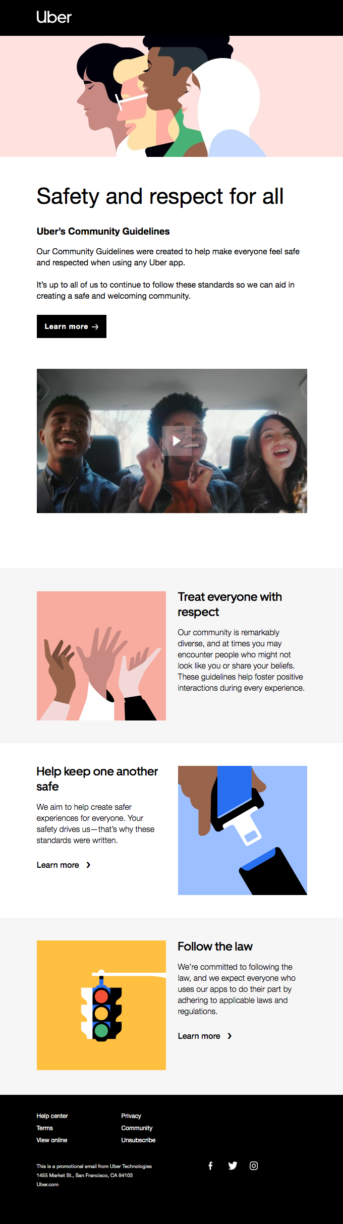
Uber
In this email, Uber introduces the community guidelines they have created for using their app. They send a clear message from the outset—with visual content and a bold headline—that they are an inclusive company, with a diverse community, and that these values are integral to creating their ideal customer experience.
 Source: Really Good Emails
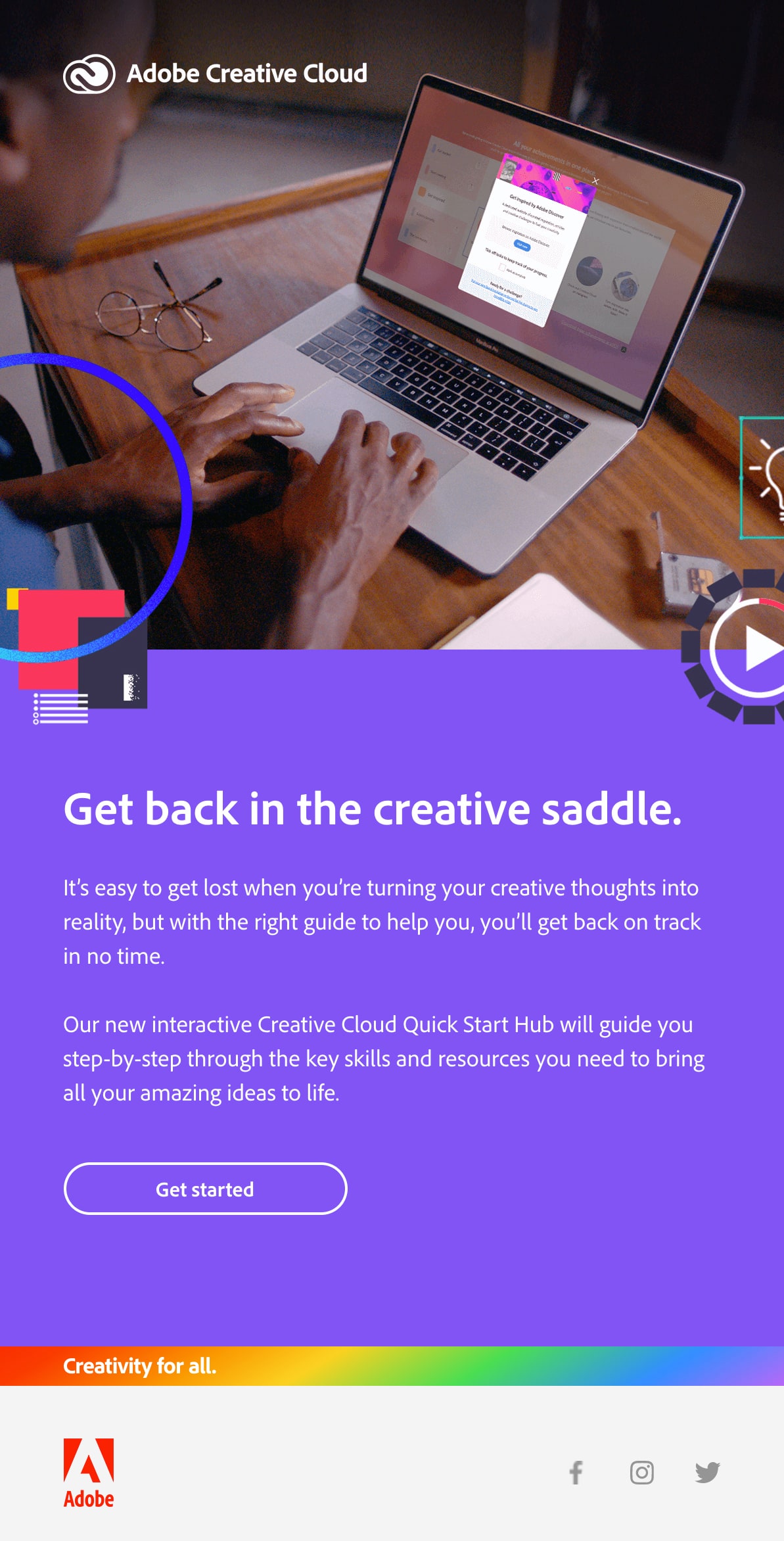
Adobe
Adobe is consistent with their Creative Cloud communications, placing an eye-catching rainbow band just before the footer of each email, stating that their product is for everyone.
Balancing styles
We have seen many great examples of design trends being leveraged to grab attention and encourage engagement in busy inboxes. In 2021, designers will breathe new life into the trends we have been watching by fusing those trends and using creative mixes of visual styles.
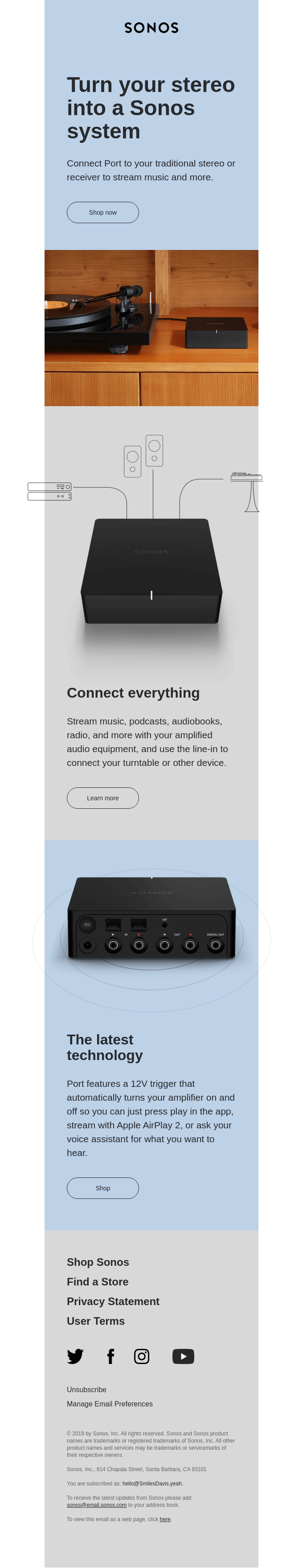
Sonos
Sonos harmoniously blends a number of styles in this promotional email, including tangible product imagery, which is complemented by simple line illustrations and subtle off-grid abstractions, with the visual content sitting just outside the boundaries of the main container.
 Source: Really Good Emails
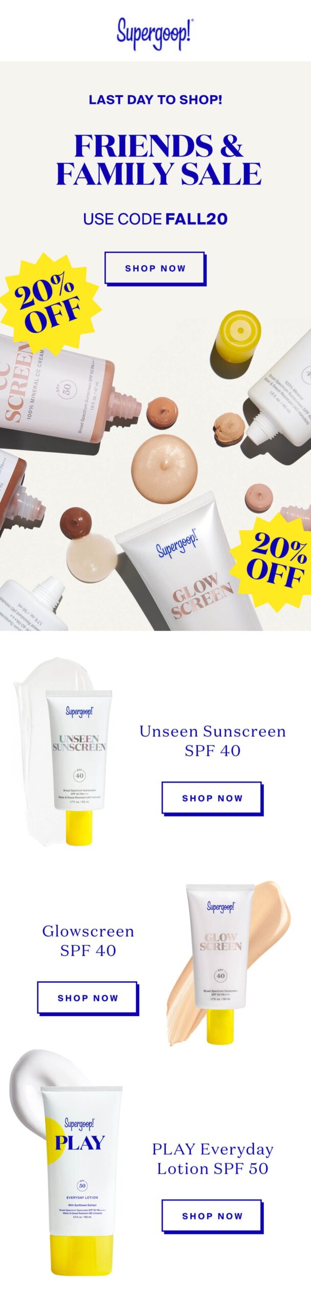
Supergoop
Cosmetics brand Supergoop also leverages tangible imagery in their promotional emails, not just showcasing their product packaging but also displaying blobs and smudges of the product within. Muted colors and generous spacing along with retro elements such as shapes and serif fonts make this a really well-balanced design.
 Source: Email Love
Which email design trends do you think we are likely to see in 2021? Let us know in the comments below!
The post Email Design Trends: What We’re Expecting in 2021 appeared first on Litmus.
![]()