On June 4th at WWDC 2018, Apple announced that macOS Mojave, Apple’s upcoming 15th release of its desktop operating system, will be shipping with a prominent new feature: Dark Mode. Dark Mode relies on a darker color palette for all windows, views, menus, and controls, making the interface more suitable for work in low-light environments or at night.
Dark Mode is available if you are a part of the Apple Beta Software Program and install the macOS Mojave beta. Users can set Dark Mode as their default interface style, or have their Macs automatically switch between Light and Dark Mode depending on the time of day.
Dark Mode provides a dark theme for all major desktop apps, including Finder, iTunes, Photos, and what’s most important for us email geeks: Apple Mail.
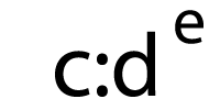
 Apple Mail in Light Mode
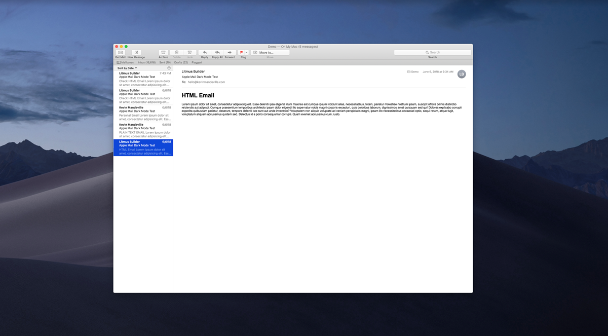
 A personal email in Dark Mode
How does Dark Mode Impact Email Design?
Good news: Dark Mode does not impact HTML emails at all by default. Dark Mode is only applied to personal and plain text emails. Even if you do not have a background color defined in your HTML email, the background is still rendered as white. So you don’t have to worry about Dark Mode messing with your code or rendering experience for regular HTML emails out of the box.
However, bright colored email backgrounds can create a very jarring experience for end users in Dark Mode. Having emails that switch from being dark to light (and vice versa) is exhausting to the eye and makes for a subpar reading experience for the subscriber.
A personal email in Dark Mode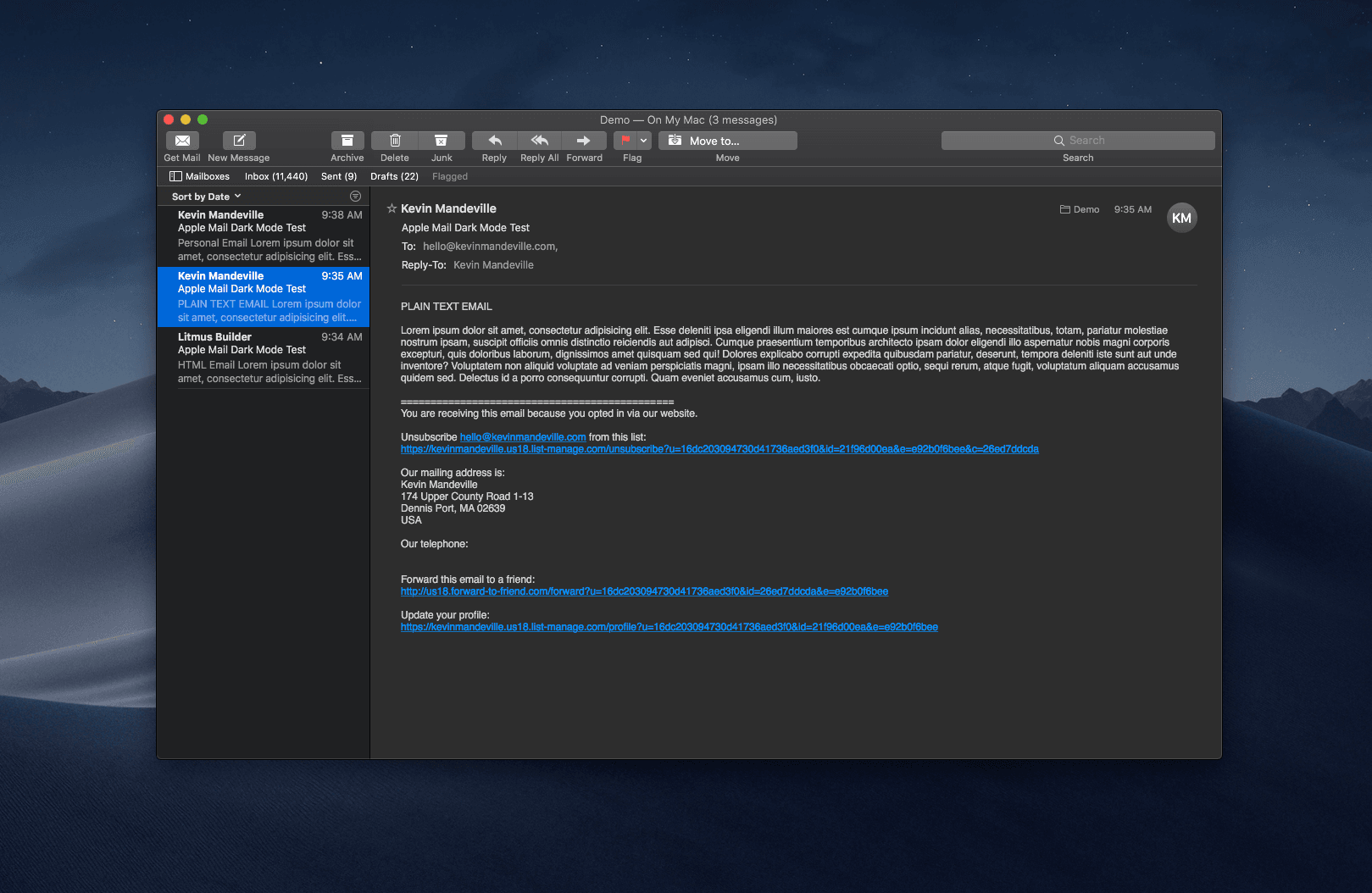 A text-only email in Dark Mode
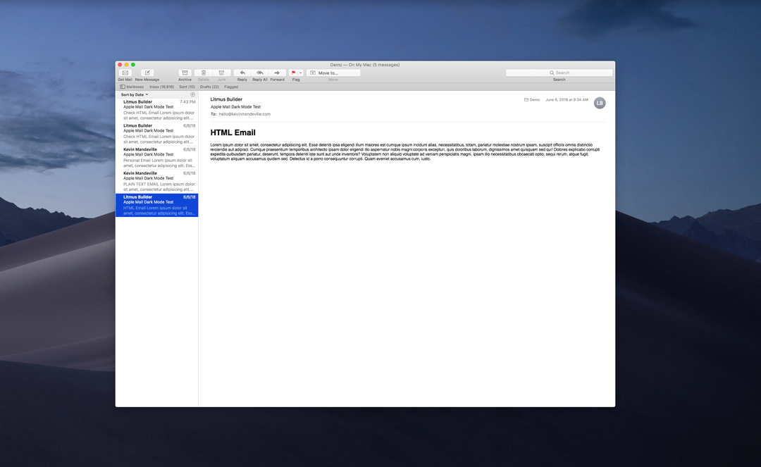
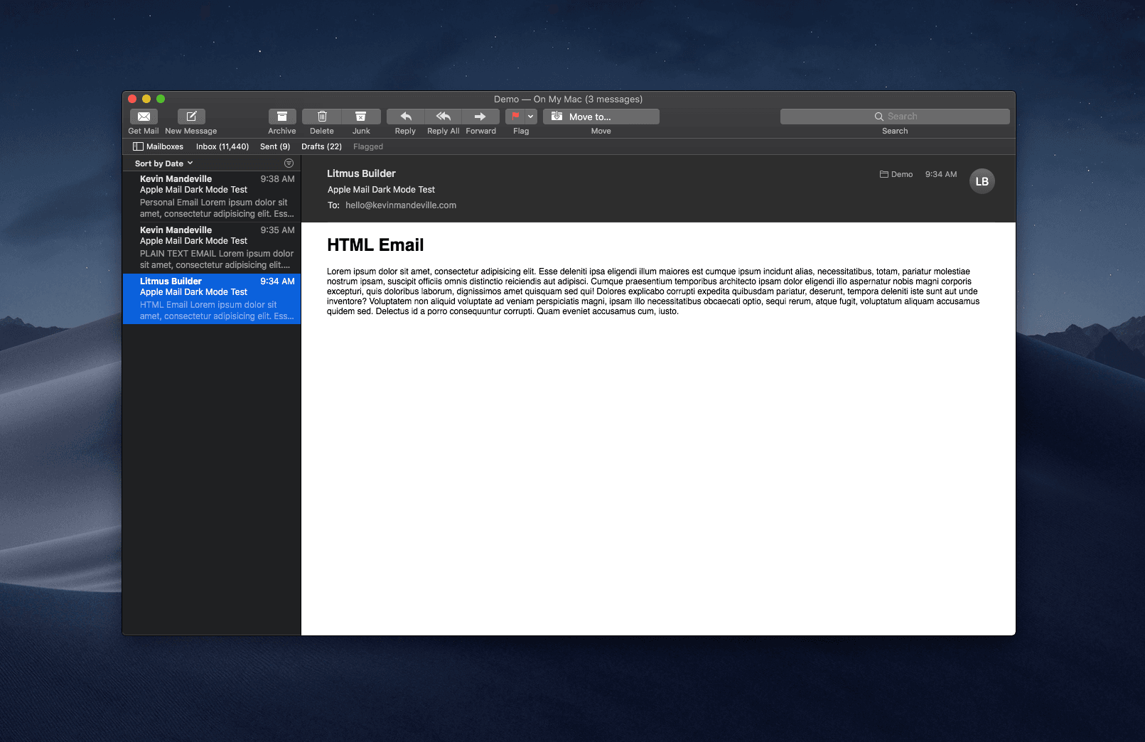 HTML Email in Dark Mode, no background color defined
Inconsistent rendering across Apple Mail and Safari
What’s odd is that Apple Mail’s behavior in Dark Mode doesn’t match that of Safari. By default, if you do not have a background color applied for your website, Dark Mode in Safari will apply its default dark background, causing the rest of the website design to “break.” So web designers actually face a bigger challenge than email designers for once.
I suspected the same, but this doesn’t seem to be the case..
pic.twitter.com/bWUvVjUPJE
— Kuldar @
(@kkuldar) June 11, 2018
How can we optimize our email designs for Dark Mode?
Here’s the bad news: There is no way to specifically target Dark Mode via CSS. Dark Mode is introducing a new user setting that isn’t supported by any universal standard yet.
#filearadar https://t.co/ea6uUd6SZC
— Guilherme Rambo (@_inside) June 14, 2018
This has triggered a massive discussion around the necessity for media query support for dark themes. Apple is currently experimenting with a private API for Dark Mode using this media query:
@media (prefers-dark-interface)*Hat tip to Keith Cirkel for the find
However, Apple is being cautious about exposing anything as they want to work to create a universal standard:
You said it, not me.
We’re considering adding a web-exposed media query, but it requires some more thought. Standardization is a thing, and API is forever.
We’d love to hear any thoughts y’all have in Radar or the public WebKit bug tracker (https://t.co/YTOGyIsAyz).
— Ricky Mondello (@rmondello) June 14, 2018


Microsoft has already introduced this vendor-specific media query that describes whether an application is being displayed in high contrast mode:
@media (-ms-high-contrast)There is also this fantastic thread in the W3C CSS Working Group’s Github on this issue. Personally, I do fancy the proposition of prefers-ui-theme with the values light-on-dark, dark-on-light, and no-preference. It’s logical, specific, and simple.
Alternative Ways to Optimize Your Emails For Dark Mode
But here’s the good news. Just because you can’t specifically target Dark Mode users (yet), that doesn’t mean you can’t optimize for the Dark Mode reading experience.
Experiment with background colors other than white that look great and work well in both the light and dark environment.
Plus, we can optimize our email designs by creating a Dark Mode or accessibility switcher with WebKit targeting that lets users toggle between a light or dark design.
Here is a basic demo concept:
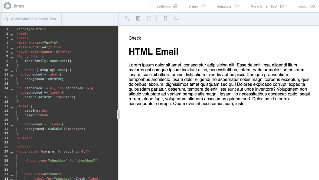
You can send yourself a test of the above code in Dark Mode to play with. The simple premise is you use a checkbox that changes the background and text color styles depending on whether it is toggled or not. This type of interactivity is supported primarily in Apple Mail, iOS Mail, and Outlook for Mac, which accounts for ~42% of global market share currently. Take a look at a full email designed to have a light and dark mode with an accessibility switcher.
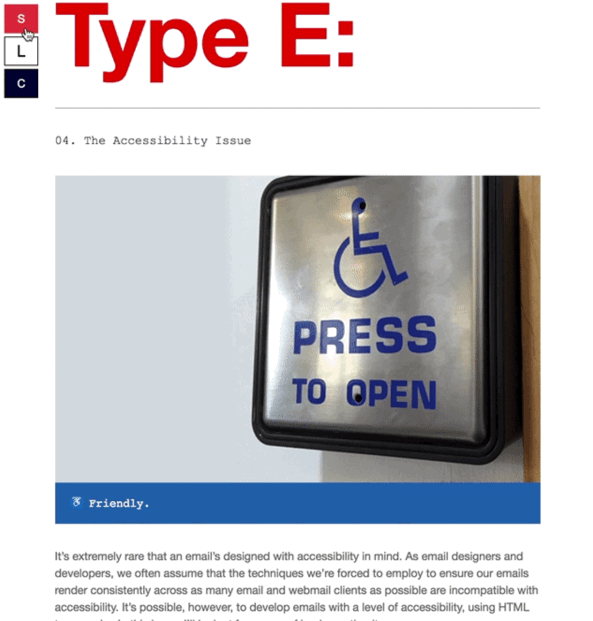 This technique was created Paul Airy in his Beyond the EnvelopeType:E newsletter.
Here are macOS Mojave’s Dark Mode Colors:
- Background: #2d2d2d
- Text Color: #dfdfdf
- Link Color: #1b89ef
So, given those values, we can create an interactive switcher that changes our design to use a background of #2d2d2d to match the rest of Apple Mail’s Dark Mode design and use the standard text colors Dark Mode uses or customize to other colors as we see fit.
This also provides the opportunity to capture subscribers’ preference over whether they prefer a light or dark theme email to display by default. Imagine a subscriber setting their theme preference in your app or newsletter settings, which gets stored in your ESP, and then gets served as the default theme for all future emails. I’m personally excited and hopeful that we will see this level of personalization stem from this environment. Granted, this approach isn’t entirely bulletproof (nothing is with email), as users could open in another app for instance, but it at least takes their preference into account (this also highlights why we need support for targeting dark modes).
If you believe in creating the best experience possible for your subscribers, supporting Dark Mode isn’t a nice-to-have, it’s a necessity.
[Tweet this >>]
Developing a light/dark theme switcher really isn’t that much overhead or investment and is a scalable implementation, if done properly. Providing a high contrast version for our emails is something we should be doing regardless of Dark Mode anyways. Many won’t take the time to optimize for it, but it’s going to separate the bad/mediocre/good from the great. World class brands and email marketing teams will support Dark Mode.
An Email Design Challenge That’s Not About Rendering
Dark Mode creates yet another environment to account for in our email designs. It highlights the ever-growing need to become context-aware for subscribers.
I love this environment being added into the world of email design because it doesn’t introduce a rendering challenge per se, but a design strategy and accessibility one.
Email design challenges aren’t always about rendering. Underneath it all, the main challenge is always about crafting personal experiences for subscribers. Dark Mode is just the latest iteration of this. [Tweet this >>]
I do ultimately believe that standards will introduce a media query that allows us to target dark themes universally, which will be a major win for developers everywhere. This is sorely needed. Until then, we can enhance with a WebKit-targeted theme switcher for now to provide the best possible experience for subscribers.
What are your thoughts?
How will you design for Dark Mode? Do you have any unique ideas on how to approach it? Will you be implementing a light/dark theme switcher? Let me know @KevinMandeville.
____________________________________
This post first appeared on www.kevinmandeville.com. Check it out!
The post Email Designers, Here’s Your Next Challenge: Apple’s Dark Mode appeared first on Litmus Software, Inc..