

Posted by rjonesx.
It’s happened to all of us. You bring up a webpage on your mobile device, only to find out that a feature you were accustomed to using on desktop simply isn’t available on mobile. While frustrating, it has always been a struggle for web developers and designers alike to simplify and condense their site on mobile screens without needing to strip features or content that would otherwise clutter a smaller viewport. The worst-case scenario for these trade-offs is that some features would be reserved for desktop environments, or perhaps a user might be able to opt out of the mobile view. Below is an example of how my personal blog displays the mobile version using a popular plugin by ElegantThemes called HandHeld. As you can see, the vast page is heavily stripped down and is far easier to read… but at what cost? And at what cost to the link graph?
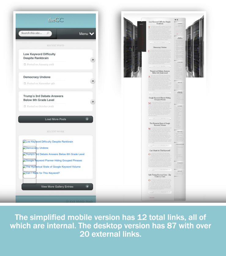
My personal blog drops 75 of the 87 links, and all of the external links, when the mobile version is accessed. So what happens when the mobile versions of sites become the primary way the web is accessed, at scale, by the bots which power major search engines?
Google’s announcement to proceed with a mobile-first index raises new questions about how the link structure of the web as a whole might be influenced once these truncated web experiences become the first (and sometimes only) version of the web Googlebot encounters.
So, what’s the big deal?
The concern, which no doubt Google engineers have studied internally, is that mobile websites often remove content and links in order to improve user experience on a smaller screen. This abbreviated content fundamentally alters the link structure which underlies one of the most important factors in Google’s rankings. Our goal is to try and understand the impact this might have.
Before we get started, one giant unknown variable which I want to be quick to point out is we don’t know what percentage of the web Google will crawl with both its desktop and mobile bots. Perhaps Google will choose to be “mobile-first” only on sites that have historically displayed an identical codebase to both the mobile and desktop versions of Googlebot. However, for the purposes of this study, I want to show the worst-case scenario, as if Google chose not only to go “mobile-first,” but in fact to go “mobile-only.”
Methodology: Comparing mobile to desktop at scale
For this brief research, I decided to grab 20,000 random websites from the Quantcast Top Million. I would then crawl two levels deep, spoofing both the Google mobile and Google desktop versions of Googlebot. With this data, we can begin to compare how different the link structure of the web might look.
Homepage metrics
Let’s start with some descriptive statistics of the home pages of these 20,000 randomly selected sites. Of the sites analyzed, 87.42% had the same number of links on their homepage regardless of whether the bot was mobile- or desktop-oriented. Of the remaining 12.58%, 9% had fewer links and 3.58% had more. This doesn’t seem too disparate at first glance.
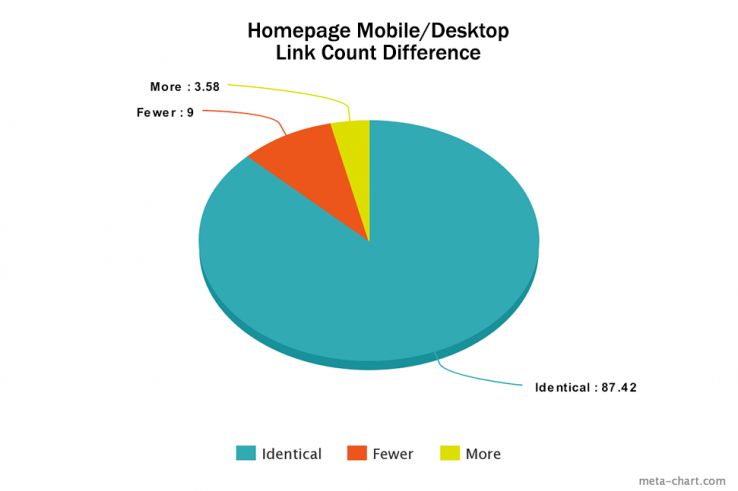
Perhaps more importantly, only 79.87% had identical links on the homepage when visited by desktop and mobile bots. Just because the same number of links were found didn’t mean they were actually the same links. This is important to take into consideration because links are the pathways which bots use to find content on the web. Different paths mean a different index.
Among the homepage links, we found a 7.4% drop in external links. This could mean a radical shift in some of the most important links on the web, given that homepage links often carry a great deal of link equity. Interestingly, the biggest “losers” as a percentage tended to be social sites. In retrospect, it seems reasonable that one of the common types of links a website might remove from their mobile version would be social share buttons because they’re often incorporated into the “chrome” of a page rather than the content, and the “chrome” often changes to accommodate a mobile version.
The biggest losers as a percentage in order were:
- linkedin.com
- instagram.com
- twitter.com
- facebook.com
So what’s the big deal about 5–15% differences in links when crawling the web? Well, it turns out that these numbers tend to be biased towards sites with lots of links that don’t have a mobile version. However, most of those links are main navigation links. When you crawl deeper, you just find the same links. But those that do deviate end up having radically different second-level crawl links.
Second-level metrics
Now this is where the data gets interesting. As we continue to crawl out on the web using crawl sets that are influenced by the links discovered by a mobile bot versus a desktop bot, we’ll continue to get more and more divergent results. But how far will they diverge? Let’s start with size. While we crawled an identical number of home pages, the second-tier results diverged based on the number of links found on those original home pages. Thus, the mobile crawlset was 977,840 unique URLs, while the desktop crawlset was 1,053,785. Already we can see a different index taking shape — the desktop index would be much larger. Let’s dig deeper.
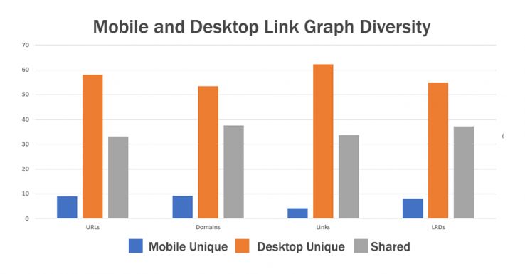
I want you to take a moment and really focus on this graph. Notice there are three categories:
- Mobile Unique: Blue bars represent unique items found by the mobile bot
- Desktop Unique: Orange bars represent unique items found by the desktop bot
- Shared: Gray bars represent items found by both
Notice also that there are there are four tests:
- Number of URLs discovered
- Number of Domains discovered
- Number of Links discovered
- Number of Root Linking Domains discovered
Now here is the key point, and it’s really big. There are more URLs, Domains, Links, and Root Linking Domains unique to the desktop crawl result than there are shared between the desktop and mobile crawler. The orange bar is always taller than the gray. This means that by just the second level of the crawl, the majority of link relationships, pages, and domains are different in the indexes. This is huge. This is a fundamental shift in the link graph as we have come to know it.
And now for the big question, what we all care about the most — external links.
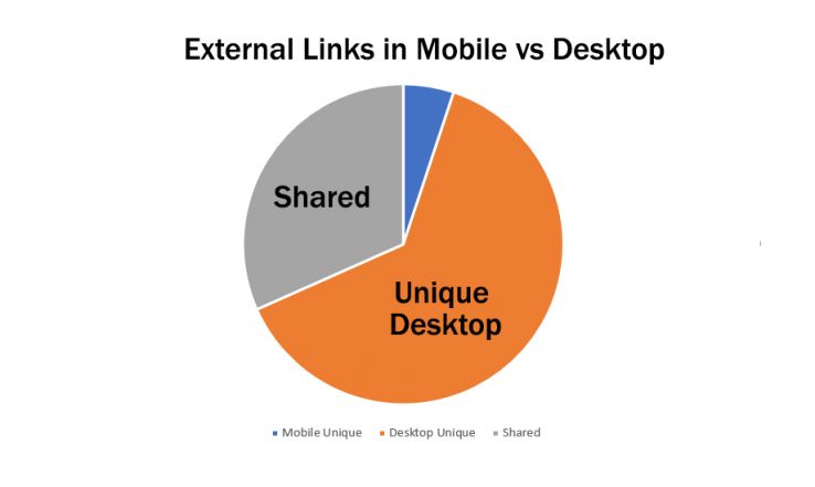
A whopping 63% of external links are unique to the desktop crawler. In a mobile-only crawling world, the total number of external links was halved.
What is happening at the micro level?
So, what’s really causing this huge disparity in the crawl? Well, we know it has something to do with a few common shortcuts to making a site “mobile-friendly,” which include:
- Subdomain versions of the content that have fewer links or features
- The removal of links and features by user-agent detecting plugins
Of course, these changes might make the experience better for your users, but it does create a different experience for bots. Let’s take a closer look at one site to see how this plays out.
This site has ~10,000 pages according to Google and has a Domain Authority of 72 and 22,670 referring domains according to the new Moz Link Explorer. However, the site uses a popular WordPress plugin that abbreviates the content down to just the articles and pages on the site, removing links from descriptions in the articles on the category pages and removing most if not all extraneous links from the sidebar and footer. This particular plugin is used on over 200,000 websites. So, what happens when we fire up a six-level-deep crawl with Screaming Frog? (It’s great for this kind of analysis because we can easily change the user-agent and restrict settings to just crawl HTML content.)
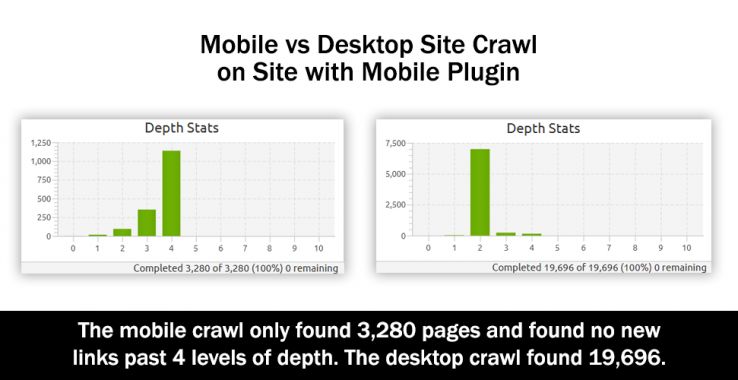
The difference is shocking. First, notice that in the mobile crawl on the left, there is clearly a low number of links per page and that number of links is very steady as you crawl deeper through the site. This is what produces such a steady, exponential growth curve. Second, notice that the crawl abruptly ended at level four. The site just didn’t have any more pages to offer the mobile crawler! Only ~3,000 of the ~10,000 pages Google reports were found.
Now, compare this to the desktop crawler. It explodes in pages at level two, collecting nearly double the total pages of the mobile crawl at this level alone. Now, recall the graph before showing that there were more unique desktop pages than there were shared pages when we crawled 20,000 sites. Here is confirmation of exactly how it happens. Ultimately, 6x the content was made available to the desktop crawler in the same level of crawl depth.
But what impact did this have on external links?
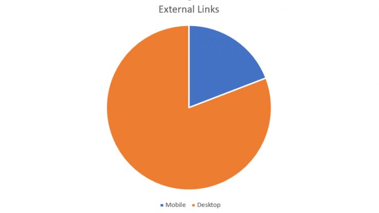
Wow. 75% of the external, outbound links were culled in the mobile version. 4,905 external links were found in the desktop version while only 1,162 were found in the mobile. Remember, this is a DA 72 site with over twenty thousand referring domains. Imagine losing that link because the mobile index no longer finds the backlink. What should we do? Is the sky falling?
Take a deep breath
Mobile-first isn’t mobile-only
The first important caveat to all this research is that Google isn’t giving up on the desktop — they’re simply prioritizing the mobile crawl. This makes sense, as the majority of search traffic is now mobile. If Google wants to make sure quality mobile content is served, they need to shift their crawl priorities. But they also have a competing desire to find content, and doing so requires using a desktop crawler so long as webmasters continue to abbreviate the mobile versions of their sites.
This reality isn’t lost on Google. In the Original Official Google Mobile First Announcement, they write…
If you are building a mobile version of your site, keep in mind that a functional desktop-oriented site can be better than a broken or incomplete mobile version of the site.
Google took the time to state that a desktop version can be better than an “incomplete mobile version.” I don’t intend to read too much into this statement other than to say that Google wants a full mobile version, not just a postcard.
Good link placements will prevail
One anecdotal outcome of my research was that the external links which tended to survive the cull of a mobile version were often placed directly in the content. External links in sidebars like blog-rolls were essentially annihilated from the index, but in-content links survived. This may be a signal Google picks up on. External links that are both in mobile and desktop tend to be the kinds of links people might click on.
So, while there may be fewer links powering the link graph (or at least there might be a subset that is specially identified), if your links are good, content-based links, then you have a chance to see improved performance.
I was able to confirm this by looking at a subset of known good links. Using Fresh Web Explorer, I looked up fresh links to toysrus.com which is currently gaining a great deal of attention due to stores closing. We can feel confident that most of these links will be in-content because the articles themselves are about the relevant, breaking news regarding Toys R Us. Sure enough, after testing 300+ mentions, we found the links to be identical in the mobile and desktop crawls. These were good, in-content links and, subsequently, they showed up in both versions of the crawl.
Selection bias and convergence
It is probably the case that popular sites are more likely to have a mobile version than non-popular sites. Now, they might be responsive — at which point they would yield no real differences in the crawl — but at least some percentage would likely be m.* domains or utilize plugins like those mentioned above which truncate the content. At the lower rungs of the web, older, less professional content is likely to have only one version which is shown to mobile and desktop devices alike. If this is the case, we can expect that over time the differences in the index might begin to converge rather than diverge, as my study looked only at sites that were in the top million and only crawled two levels deep.
Moreover (this one is a bit speculative), but I think over time that there will be convergence between a mobile and desktop index. I don’t think the link graphs will grow exponentially different as the linked web is only so big. Rather, the paths to which certain pages are reached, and the frequency with which they are reached, will change quite a bit. So, while the link graph will differ, the set of URLs making up the link graph will largely be the same. Of course, some percentage of the mobile web will remain wholly disparate. The large number of sites that use dedicated mobile subdomains or plugins that remove substantial sections of content will remain like mobile islands in the linked web.
Impact on SERPs
It’s difficult at this point to say what the impact on search results will be. It will certainly not leave the SERPs unchanged. What would be the point of Google making and announcing a change to its indexing methods if it didn’t improve the SERPs?
That being said, this study wouldn’t be complete without some form of impact assessment. Hat tip to JR Oakes for giving me this critique, otherwise I would have forgotten to take a look.
First, there are a couple of things which could mitigate dramatic shifts in the SERPs already, regardless of the veracity of this study:
- A slow rollout means that shifts in SERPs will be lost to the natural ranking fluctuations we already see.
- Google can seed URLs found by mobile or by desktop into their respective crawlers, thereby limiting index divergence. (This is a big one!)
- Google could choose to consider, for link purposes, the aggregate of both mobile and desktop crawls, not counting one to the exclusion of the other.
Second, the relationships between domains may be less affected than other index metrics. What is the likelihood that the relationship between Domain X and Domain Y (more or less links) is the same for both the mobile- and desktop-based indexes? If the relationships tend to remain the same, then the impact on SERPs will be limited. We will call this relationship being “directionally consistent.”
To accomplish this part of the study, I took a sample of domain pairs from the mobile index and compared their relationship (more or less links) to their performance in the desktop index. Did the first have more links than the second in both the mobile and desktop? Or did they perform differently?
It turns out that the indexes were fairly close in terms of directional consistency. That is to say that while the link graphs as a whole were quite different, when you compared one domain to another at random, they tended in both data sets to be directionally consistent. Approximately 88% of the domains compared maintained directional consistency via the indexes. This test was only run comparing the mobile index domains to the desktop index domains. Future research might explore the reverse relationship.
So what’s next?: Moz and the mobile-first index
Our goal for the Moz link index has always been to be as much like Google as possible. It is with that in mind that our team is experimenting with a mobile-first index as well. Our new link index and Link Explorer in Beta seeks to be more than simply one of the largest link indexes on the web, but the most relevant and useful, and we believe part of that means shaping our index with methods similar to Google. We will keep you updated!
Sign up for The Moz Top 10, a semimonthly mailer updating you on the top ten hottest pieces of SEO news, tips, and rad links uncovered by the Moz team. Think of it as your exclusive digest of stuff you don’t have time to hunt down but want to read!