We’ve all been there. You create a beautiful email with interesting GIFs, accessible buttons, and eye-catching images. Then you test it, and it looks great… except in Outlook, where it’s completely broken. People can’t engage the way you want them to with a broken email.
Outlook has been a plague of email marketers for a long time, but does it have to be? How can we work with it? Read on to find out how I came to love Outlook, despite its many faults. I’ll cover:
The many versions of Microsoft Outlook
The name “Outlook” covers several different email clients with a couple of different rendering engines and at least two different viewing settings. All of this can be a giant headache if you let it. Let’s dive in and see if we can straighten it out a bit.
Outlook 2007-2019
These are the Windows desktop versions of Outlook. These use Word as the rendering engine, which made sense at a time when email was like writing letters. Ah, simpler times. But, for email marketers, it doesn’t cut it for rendering HTML emails.
120 DPI (dots per inch) adds to the complexity. Windows users can choose 120 DPI to increase their screen resolution. If they do, the desktop email clients will respect that and will update images and text to be larger. Which can wreak havoc on your email.
Outlook for Mac
This is the Mac desktop version of Outlook. It uses Webkit as the rendering engine. Which means it’s usually on par with Apple Mail and iOS as far as email rendering is concerned. If it looks good in your browser, there’s a decent chance it will look good here.
Outlook.com and the Outlook mobile apps
These clients use Webkit or Webkit-based rendering engines, so they provide good HTML rendering and don’t usually break your emails.
Outlook Office 365
There are two different versions of Outlook Office 365, the desktop email client and the web-based email client. The desktop version is similar to Outlook 2007-2019 and uses Word as a rendering engine (hard for email). The web-based email client uses Webkit or Blink and renders emails similarly to Outlook.com (much easier).
 |
No more broken emails Preview your emails across 90+ email clients, apps, and devices—including all versions of Outlook—to ensure an on-brand, error-free subscriber experience. |
One Outlook to rule them all
In January, Microsoft announced their “One Outlook” vision to replace the desktop clients with one client that works everywhere starting sometime in 2022.
The new email client will be based on current Outlook web apps. So hopes are high that it’ll have a Webkit-based rendering engine and will render HTML emails well. Unfortunately, all those old desktop clients aren’t going to just disappear when that happens, so they’ll still have to be supported to some extent.
Do or do not, there is no try
Is your head spinning yet?
If it is, then let’s distill it for you: The key takeaway is that we’re working with two different rendering engines—Word and Webkit. Webkit is easier to code for, and Word is more difficult. Neither is really good or bad. They just require different approaches and have different quirks that need to be taken into consideration.
Let’s look at some of the common rendering issues in Outlook desktop clients and how to solve them.
Do include width and height attributes on your images
Outlook does not support CSS styles for widths and heights, and if you don’t include the width and height attributes, Outlook will display your image at its actual size. If you’re using retina images (which you should be), that means some giant images that’ll break your emails.
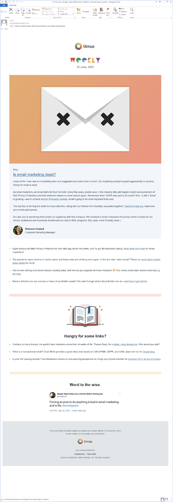 Retina image without a width attribute in Outlook making the email wider
Do include ALT text
Don’t let Outlook’s security message speak for your images. Make sure to include ALT text in your images. Especially as Outlook doesn’t display images by default unless people turn the feature on.
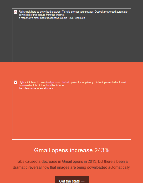 Email in Outlook with images blocked
Do use tables
Email has come a long way and you can use <div> blocks in lots of email clients, but Outlook isn’t one of them. Outlook will ignore most styles that you apply to your <div> tags including widths and paddings. So it’s important that you use <table> tags for your content instead.
Do use Outlook-specific code to solve rendering issues
This may not solve all your issues, but there are a lot of times that including some Outlook-specific CSS can help you solve a rendering issue that you’re only seeing on Outlook. Or you may hide a small block that isn’t working on Outlook, and use conditional code to show a version that would work for a specific version of Outlook. (More on conditional code later.)
Do add line heights to small images or table cells
Outlook sets a minimum height on table cells and images. So if you’re using a table cell as a spacer or have a small image, make sure to add a line height attribute to the element equal to the height that you want them to appear. For example:
<tr> <td style="font-size: 5px; line-height: 5px; mso-line-height-rule: exactly;"> </td> </tr>
Do correct for DPI scaling issues
On Windows computers, there’s a global setting that people can change (or in some cases, are set higher by default) that scales up the text and graphical elements to make them larger and easier to read. This is great for accessibility, but not so great for Outlook as only some elements are scaled up while others aren’t.
Luckily, there’s a fix. First, you have to add an XML namespace to the HTML tag:
<html lang="en" xmlns="http://www.w3.org/1999/xhtml" xmlns:o="urn:schemas-microsoft-com:office:office">
Then, add some code to fix for image scaling right before the </head> tag:
<!--[if gte mso 9]> <xml> <o:OfficeDocumentSettings> <o:AllowPNG/> <o:PixelsPerInch>96</o:PixelsPerInch> </o:OfficeDocumentSettings> </xml> <![endif]-->
And finally, make sure to include any set widths as a CSS property with pixels and not as an attribute on your tables.
✗ Not this with width=”600″:
<table cellpadding="0" cellspacing="0" border="0" role="presentation" width="600">
 Yes, like this with style=”width:600px;”:
<table cellpadding="0" cellspacing="0" border="0" role="presentation" style="width:600px;">
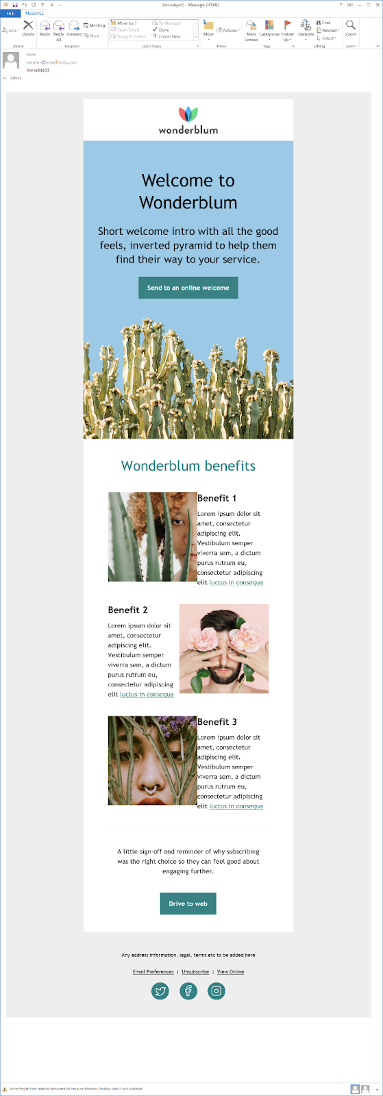
That will fix most of your issues for 120 DPI clients. Take a look at this side-by-side comparison before and after this fix:
| Outlook 2013 at 120 DPI (without fix) | Outlook 2013 at 120 DPI (with fix) |
|---|---|
 |
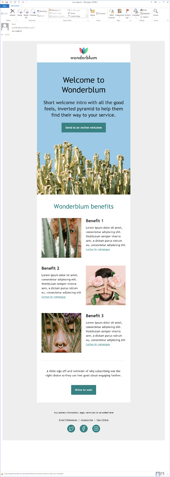 |
What a difference, huh?
Do not expect hover effects to work
Outlook doesn’t support the hover pseudo class. You should still include it to create interactions to increase the accessibility of your email in other email clients, but don’t be surprised when it doesn’t work in Outlook.
Do not depend on an animated GIF to get your point across
Outlook desktop clients do not support animated GIFs. You can have the initial frame display the image you want to show up in Outlook, or you can hide the animated GIF from Outlook and use conditional coding to display a still image that you want. (Again, more on conditional coding next.)
Do not use interactive content without a fallback
Interactive emails are a big no for Outlook. They depend on either AMP coding or the checkbox hack, both of which aren’t supported on Outlook.
In the case of AMP for email, the HTML file will be displayed instead of the AMP one, so no extra coding for that. For the checkbox hack interactivity, you will have to hide the interactive content and show the Outlook fallback. Again, conditional coding is your friend here.
Do not add padding or margins to images
Outlook strips padding and margins off of images. Make sure to add padding to the table cell around the image instead. Or if you have the image in the same cell as copy, add margin to the tag around the copy (<h1>, <h2>, <p>, etc.).
Fear is the email killer: the code you need to face your Outlook fears
Coding a great email for Outlook’s desktop email clients requires jumping outside the “normal” HTML and CSS. There are three types of code that will help make your emails shine in these clients: conditional coding, MSO properties, and VML.
It can be scary to work with something new, but I promise it’s worth it. And that moment when you get it to work properly? You’ll feel like you just made the Kessel Run in less than 12 parsecs.
Conditional coding
Conditional coding is coding that looks at what email client or browser your subscriber is using and only showing the code if it fulfils the conditional inside the comment, such as:
<!--[if mso]> <p>This content is only visible on Outlook desktop clients</p> <![endif]-->
You can even use this to target specific versions of Outlook’s desktop clients by adding the version numbers:
<!--[if mso 14]> <p>This content is only visible on Outlook 2010 desktop client</p> <![endif]-->
Outlook is anything but straightforward, though, so the version numbers don’t correspond with the name of the email client:
- Outlook 2000 = mso 9
- Outlook 2002 = mso 10
- Outlook 2003 = mso 11
- Outlook 2007 = mso 12
- Outlook 2010 = mso 14
- Outlook 2013 = mso 15
- Outlook 2016, Outlook 2019, and Office 365 desktop = mso 16
And then you can get more intricate by targeting a range of clients with less than (lt), greater than (gt), less than or equal to (lte), or greater than or equal to (gte). For example:
<!--[if (gte mso 9) | (lte mso 11)]> <p>This content is only visible on Outlook 2000 to Outlook 2003</p> <![endif]-->
So if you’re only seeing some wild stuff happening on a specific client, you can target that client specifically and hide and show better content for it.
You can also use conditional comments to hide content from Outlook by saying “if !mso” meaning “if not mso”:
<!--[if !mso]><!--> <p>This is visible on anything except Outlook desktop clients</p> <!--<![endif]-->
Something to keep in mind: Conditional code only works on Outlook desktop clients. As this is where a lot of issues come into play, you’ll probably need these more than any fix for the webmail clients.
But there are ways to target the web clients as well, though no way to target one Outlook web client over the other. So when you target Outlook.com, you’ll also target the Office 365 web client (but not the desktop client).
You can target the Outlook web clients by exploiting the fact that Outlook appends “x_” to all class names, but doesn’t do this for the attribute selector. So if you have a class “foo” and want to treat it differently for Outlook web clients, you can target it with this code:
[class~="x_foo"] { }
(Thanks to Mark Robbins for this fix and to Dylan Smith for howtotarget.email.)
MSO properties
As mentioned above, there is CSS specific to Outlook that you can add that will only affect Outlook desktop email clients. Here are a few you’ll find that are pretty common, and you may have already heard of them:
mso-hide: all;
This property will hide everything from Outlook desktop clients. It does get stripped out when the email is forwarded, so be wary of using it by itself if that’s a function you know your subscribers often take advantage of. You can pair it with the “if not mso” conditional code if you’re a “just in case” coder.
mso-line-height-rule: exactly;
This property ensures that Outlook displays your line height at what you designate in the line-height property. Without it, Outlook doesn’t necessarily respect your line heights. If you’re working in an industry where precision is key, you’re probably very familiar with this property.
mso-padding-alt
This one’s a little less common, but I’ve had to use it from time to time. It lets you declare padding that is specific to Outlook. So if the normal padding you have on a cell isn’t rendering quite right in Outlook, you can use it to set values that fit your design for Outlook.
mso-ansi-font-size
This is another one that I only use occasionally. It lets you set font sizes specific to Outlook. So if Outlook is rendering your font a touch bigger than other email clients and you end up with a short final line of copy you didn’t want, add mso-ansi-font-size and set a font size that makes your copy fit.
There are lots more MSO properties that you can use, so go ahead and see if there’s anything that will fix a rendering issue for you.
VML
VML stands for Vector Markup Language. It is Microsoft’s version of SVG, but the language has been depreciated and is very rarely used (yay email!). Microsoft does have the documentation for VML archived online, so you can still look up how to use it to create vectors in Outlook, where it is still supported. Theoretically, when Microsoft transitions to their “One Outlook” model, we’ll be able to leave VML behind.
Make sure to include the VML namespace declaration. I usually add it to the <html> element in my boilerplate template so I can use VML whenever I need to:
<html lang="en" xmlns:v="urn:schemas-microsoft-com:vml">
Once you have that, you can add any VML to your code inside MSO conditionals:
<!--[if mso]> <v:rect fillcolor="blue" stroked="false" style="width:200px; height:50px;"></v:rect> <![endif]-->
That code would make a blue rectangle that’s 200px by 50px. Maybe not something you can actually use in an email, but you can use VML to add buttons with rounded corners to your code, background images, and background gradients. Campaign Monitor has two tools created by Stig to help you create background images or buttons with rounded corners. I found those are a great way to add VML when you’re just learning.
You can also use VML to create faux absolute positioning, shadow effects, or a fallback to support CSS art in Outlook. There’s lots you can do with VML once you dive in.
Live long and email
Outlook has long been the bane of email marketers, but it doesn’t have to be.
With the right tools, you can create beautiful emails that render correctly in Outlook. Check out the resources throughout this post to build up your Outlook coding chops, and test them out in your emails with Litmus Builder and Email Previews. Think of coding for Outlook as a puzzle waiting to be solved, and you may find yourself loving Outlook and all of its quirks.
 |
Test your emails in Outlook with Litmus See how your emails will look in Outlook and fix any issues before you hit send. With Litmus, feel confident that you’re creating pixel-perfect emails your subscribers can engage with. |
The post Outlook Email Rendering: How I Learned to Stop Worrying and Love Outlook appeared first on Litmus.
![]()

