Dark Mode. The tech industry is buzzing with these two words, and email marketing is no exception. In 2018, Apple added Dark Mode to its desktop email client. The following year, Dark Mode came to iOS Mail. And other industry heavyweights, including Gmail, announced support for Dark Mode. There’s no denying it…
Dark Mode is taking over the inbox—and making sure emails look great in this reading environment is the new big challenge for email marketers. Tweet this →
In this post, we break down which email clients offer Dark Mode, how each client’s Dark Mode settings impact your email designs, and what you can do to improve your emails for subscribers that read in Dark Mode.
Ready to dive in? Let’s recap the basics.
Dark Mode: A Darker Color Palette for Low-Light or Nighttime Environments
Dark Mode is a reversed color scheme that utilizes light-colored typography, UI elements, and iconography on dark backgrounds—and it’s one of the hottest digital design trends in the past year. From Apple’s OS to apps like Twitter, Slack, or Facebook Messenger, most popular operating systems and apps now allow users to switch to Dark Mode. Dark Mode is a hot topic—and there’s good reason. Many users prefer Dark Mode because:
- It’s easier on the eyes. Light text on a dark background is much better for minimizing eye strain, especially in low-light situations.
- It reduces screen brightness, saving your battery life.
- It can improve content legibility and can make it easier for some users to consume content on desktop and mobile.
- They may simply have a preference for darker interfaces.
With Dark Mode popularity growing, it’s no surprise that it’s coming to the inbox, too.
Which email clients support Dark Mode?
These clients and apps currently offer Dark Mode—either as a setting that the user can set manually or by automatically detecting the user’s preferred color scheme:
Mobile Apps
- iPhone Mail
- iPad Mail
- Gmail App (Android)
- Gmail App (iOS)
- Outlook App (Android)
- Outlook App (iOS)
Desktop Clients
- Apple Mail
- Outlook 2019 (Mac OS)
- Outlook 2019 (Windows)
Web Clients
- Outlook.com
- Hey.com
But just because all these email clients offer a way to set their UI to a dark color scheme, that doesn’t mean that they handle your emails the same ways. Email rendering is complex. An email that looks great in one client might look broken in another. Now, Dark Mode is adding another layer of complexity. In fact, there are various ways a Dark Mode email client might deal with your code.
How are clients applying Dark Mode to my emails?
At the moment, there appear to be three fundamentally different types of color schemes that email clients use to apply Dark Mode to emails. Let’s look at them one by one (or jump straight to the Dark Mode Email Client Support Chart).
No color changes
Yes, you read right. Some email clients let you change their UI to Dark Mode, but that doesn’t have any impact on how your HTML email is rendered. Whether the app is set to Light or Dark Mode, your email will look exactly the same. Certain email clients will always render your Light Mode designs by default (unless you specifically add code to trigger Dark Mode, which I’ll discuss later). Here’s a list of those clients:
- Apple Mail
- iPhone
- iPad
- Hey.com
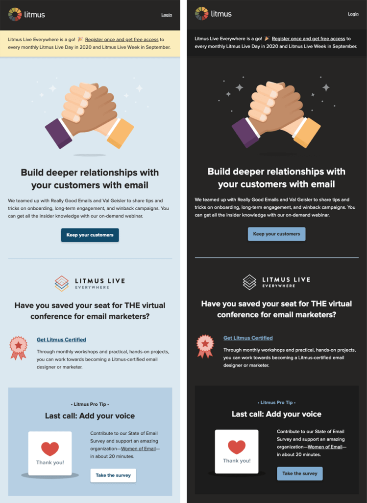
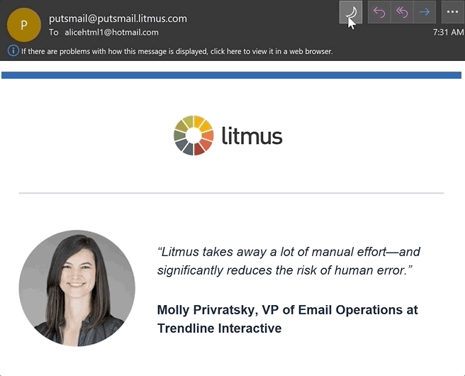
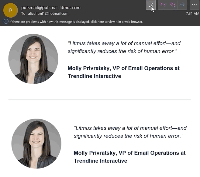
Check out this email example in Apple Mail: The design of the email stays exactly the same, no matter if you view it in the dark or light email client UI:
There are a few exceptions though: First, plain text emails do trigger the application of a Dark Mode theme, and the minimum code that blocks Dark Mode from applying to a plain text email is a 2×1 image—this is to ensure that you can include a 1×1 tracking pixel while retaining a “plain text” feel.
Secondly, if you accidentally leave Dark Mode <meta> tags in your template, Apple Mail / iPhone / iPad will auto-convert any instance of pure white #ffffff to dark gray unless you override it with your custom Dark Mode styles. Or alternatively, you can use an off-white like #fffffe instead.
Dark Mode Options: Default vs. Custom
There are quite a few email clients that will automatically force their default Dark Mode onto your email if you don’t do anything at all. But if you’re like most of us and you’re not a fan of these Default styles, you might want to go with the third option: design and code your own Dark Mode theme. Below, you can see a side-by-side of an email with a Light Mode theme, and a Custom Dark Mode theme.
Default Dark Modes: Partial Color Invert
Before we look into how to approach a custom Dark Mode theme though, let’s check out how other Email clients treat their Default Dark Modes. The first Dark Mode theme is what I like to call a “Partial Color Invert.” It only detects areas with light backgrounds and inverts them so the light backgrounds are dark, while the dark text becomes light. It generally leaves areas that already have dark backgrounds alone, resulting in a fully Dark Mode design. Fortunately, most email clients that use this method also support Dark Mode targeting, so you can override the client-default dark theme.
Outlook.com is an email client that partially inverts colors, like you can see in this screenshot:

Default Dark Modes: Full Color Invert
The Full Color Invert is the most invasive color scheme: It not only inverts the areas with light backgrounds but also impacts dark backgrounds. So if you already designed your emails to have a dark theme, this scheme will ironically force them to become light. Unfortunately, this is currently the tactic used by some of the more popular email clients, such as Gmail app (iOS13) and Outlook 2019 (Windows).
In the example below, you can see the light backgrounds have been converted to dark versions of the original colors. And areas that previously had a dark background with light text are now light with dark text.

Not only does this Full Color Invert scheme most radically change your email, but the email clients that use this logic also don’t allow Dark Mode targeting at the moment. Email clients are still figuring out how to best implement Dark Mode and may be open to feedback from users—especially since not allowing developers to target Dark Mode with their own styles can have a negative impact on legibility and accessibility.
In the interest of advocating for better Dark Mode targeting support and less invasive Dark Mode theming logic, you can communicate your thoughts directly to Gmail’s Accessibility team, and you can also contribute your screenshots of Gmail’s Dark Mode breaking your email.
How do I target Dark Mode users with my own styles?
As noted above, how email clients in Dark Mode handle your regular HTML emails will vary. But what if you’d like to apply your own Dark Mode styles that could very well differ from email clients’ default color schemes? Here are two methods you can use:
@media (prefers-color-scheme: dark)
This method works in very much the same way as applying a block of styles inside a @media query for your Mobile Responsive view, except this CSS block targets any user interface that’s set to Dark Mode.
[data-ogsc]
This is a method first brought to our attention by Mark Robbins to target the Outlook app. While it seems like a pretty narrow market share, it’s relatively easy to simply duplicate the @media (prefers-color-scheme: dark) styles you already applied and simply add the appropriate [data-ogsc] prefixes to each CSS rule.
But—and there’s always a “but” in email—there’s no consistent support for these targeting methods either. So which email client follows which color scheme by default? And while some email clients—we’re looking at you, Gmail—offer email designers no opportunities to target Dark Mode to optimize the reading experience, most clients can be targeted with either the @media (prefers-color-scheme: dark) or [data-ogsc] methods.
We’ve tested the Dark Mode settings in the following email clients to see how they impact a regular email that doesn’t include any Dark Mode-specific targeting as well as support for targeting Dark Mode. Here’s what we found…
Dark Mode email client support chart (as of July 2020)
|
Email Client |
HTML Treatment in Dark Mode |
@media |
[data‐ogsc] |
Quirks |
|
Apple Mail (MacOS) |
No change* |
✓ Yes |
✘ No |
*Pure white (#ffffff) BGs will be inverted if <meta> is present |
|
iPhone / iPad (iOS 13) |
No change* |
✓ Yes |
✘ No |
*Pure white (#ffffff) BGs will be inverted if <meta> is present |
|
Hey.com |
No change |
✓ Yes |
✘ No |
|
|
Outlook.com |
Partial invert |
? Partial* |
? Partial** |
*Some BG colors will be darkened |
|
Outlook 2019 (MacOS) |
Partial invert |
? Partial* |
✘ No |
*Some BG colors will be darkened |
|
Outlook 2019 (WinOS) |
Full invert |
✘ No |
✘ No |
|
|
Outlook app (iOS) |
Partial invert |
? Partial* |
✘ No |
*Some BG colors will be darkened |
|
Outlook app (Android) |
Partial invert |
✘ No |
? Partial* |
*Some BG colors will be darkened |
|
Gmail app (iOS) |
Full invert |
✘ No |
✘ No |
|
|
Gmail app (Android) |
Partial invert |
✘ No |
✘ No |
|
When you’re applying these styles to your emails for use across email clients, keep these things in mind:
1. Optimize your logos and other images for all styles
Add a translucent outline to transparent PNGs with dark text for legibility in email clients where Dark Mode can’t be targeted, like Gmail App and Outlook 2019 (Windows). This will help prevent any issues where the email client might decide to use either the Partial Color Invert or Full Color Invert settings—and make things easier on the eyes for your subscribers. Opting for transparent backgrounds wherever possible will help with this.
If your images are not transparent and include backgrounds, make sure there is enough padding around your focal point to avoid an awkward juxtaposition.
Plus, swap Light Mode and Dark Mode images with the @media (prefers-color-scheme: dark) and [data-ogsc] methods described in this guide.
2. Enable Dark Mode in email client user agents
By including this metadata in your <head> tag, you can ensure that Dark Mode is enabled in your email for subscribers that have Dark Mode turned on:
<meta name="color-scheme" content="light dark"> <meta name="supported-color-schemes" content="light dark">
3. Add Dark Mode styles for @media (prefers-color-scheme: dark)
Add this media query in your embedded <style></style> section for custom dark mode styles in iOS, Apple Mail, Outlook.com, Outlook 2019 (MacOS), and Outlook App (iOS).
The .dark-img and .light-img classes are particularly useful for showing a dark mode-specific logo if having an outlined logo isn’t ideal.
Example CSS:
@media (prefers-color-scheme: dark ) { /* Shows Dark Mode-Only Content, Like Images */ .dark-img { display:block !important; width: auto !important; overflow: visible !important; float: none !important; max-height:inherit !important; max-width:inherit !important; line-height: auto !important; margin-top:0px !important; visibility:inherit !important; } /* Hides Light Mode-Only Content, Like Images */ .light-img { display:none; display:none !important; } /* Custom Dark Mode Background Color */ .darkmode { background-color: #272623 !important; } /* Custom Dark Mode Font Colors */ h1, h2, p, span, a, b { color: #ffffff !important; } /* Custom Dark Mode Text Link Color */ .link { color: #91ADD4 !important; } }
4. Duplicate Dark Mode styles with [data-ogsc] prefix
Add this styling for support in Outlook app (Android).
Example CSS:
/* Shows Dark Mode-Only Content, Like Images */ [data-ogsc] .dark-img { display:block !important; width: auto !important; overflow: visible !important; float: none !important; max-height:inherit !important; max-width:inherit !important; line-height: auto !important; margin-top:0px !important; visibility:inherit !important; } /* Hides Light Mode-Only Content, Like Images */ [data-ogsc] .light-img { display:none; display:none !important; } /* Custom Dark Mode Background Color */ [data-ogsc] .darkmode { background-color: #272623 !important; } /* Custom Dark Mode Font Colors */ [data-ogsc] h1, [data-ogsc] h2, [data-ogsc] p, [data-ogsc] span, [data-ogsc] a, [data-ogsc] b { color: #ffffff !important; } /* Custom Dark Mode Text Link Color */ [data-ogsc] .link { color: #91ADD4 !important; }
5. Apply your Dark Mode-only styles to your body HTML
Make sure all of your HTML tags have the appropriate Dark Mode classes inserted. Here is an example of the .dark-img and .light-img classes as they appear in our Light Mode vs. Dark Mode logos.
Example CSS:
<!-- start HEADER_LOGO --> <a href="http://litmus.com/" target="_blank"> <img class="light-img" src="https://campaigns.litmus.com/_email/_global/images/logo_icon-name-black.png" width="163" height="60" alt="Litmus" style="color: #33373E; font-family:'proxima_nova', Helvetica, Arial, sans-serif; text-align:center; font-weight:bold; font-size:36px; line-height:40px; text-decoration: none; margin: 0 auto; padding: 0;" border="0" /> <!-- The following Dark Mode logo image is hidden with MSO conditional code and inline CSS, but will be revealed once Dark Mode is triggered --> <!--[if !mso]><! --><div class="dark-img" style="display:none; overflow:hidden; float:left; width:0px; max-height:0px; max-width:0px; line-height:0px; visibility:hidden;" align="center"> <img src="https://campaigns.litmus.com/_email/_global/images/logo_icon-name-white.png" width="163" height="60" alt="Litmus" style="color: #ffffff; font-family:'proxima_nova', Helvetica, Arial, sans-serif; text-align:center; font-weight:bold; font-size:36px; line-height:40px; text-decoration: none; margin: 0 auto; padding: 0;" border="0" /> </div><!--<![endif]--> </a> <!-- end HEADER_LOGO -->
6. ABT: Always Be Testing!
As we always mention, email clients are constantly changing. Especially with a new feature like Dark Mode, tweaks to rendering logic are coming quickly and frequently. The only way to be on top of it all is to test every email with a tool like Litmus.
Respect user preferences when it comes to Dark Mode
One of the biggest benefits of Dark Mode is its assistance with reducing eye strain for users in low-light conditions or for other personal reasons. If your subscribers are making that conscious decision to view emails in dark mode, it’s best to respect that. Just like you’d want to add ALT text in case your users prefer to have images off by default, you should build emails that respect darker interfaces, too.
 |
Ready to see what your emails will look like in Dark Mode?See how Apple Mail, iOS Mail, and Outlook 2019 render your emails in Dark Mode with Litmus Email Previews. |
This article was originally published November 20, 2019. Last updated September 16, 2020.
The post The Ultimate Guide to Dark Mode for Email Marketers appeared first on Litmus.
![]()