Email marketers and designers are constantly looking for ways to set their campaigns apart in the inbox. From design to dynamic content and promotions to personalization, marketers are testing out different techniques to pique subscriber interest and increase engagement.
One of the more common ways to enhance emails is by adding animation and motion to a campaign. Motion helps draw the eye to specific content and suck the user into that content. While motion in email has traditionally been achieved through animated GIFs, CSS animations can sometimes be a more effective technique.
CSS animations are animations that are built using code—specifically HTML and CSS. Using a handful of CSS properties, email marketers can manipulate the HTML of their campaigns and create a similar sense of motion as when using animated GIFs. Perhaps more importantly, they can create more interactive and engaging campaigns, too.
In this guide, we’ll explore the pros and cons of using CSS animations in email, as well as the code that powers CSS animations.
Why use CSS animations?
CSS animations have been around for years, but are only recently seeing wider use both in the web and email industries. For a long time, animation on the web was created either in a proprietary tool like Adobe Flash or Microsoft Silverlight or as an animated GIF—an image format that allows for frame-based animations. Since email clients never really supported the use of Flash or Silverlight in the inbox, email marketers were left using animated GIFs if they wanted movement in their campaigns.
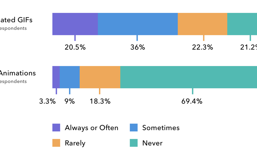
This is largely still the case. According to our 2018 State of Email Survey, 78% of brands use animated GIFs in their campaigns, whereas only 30% use CSS animations.
 Source: Litmus’ 2018 State of Email Survey of 3,000 marketing professionals.
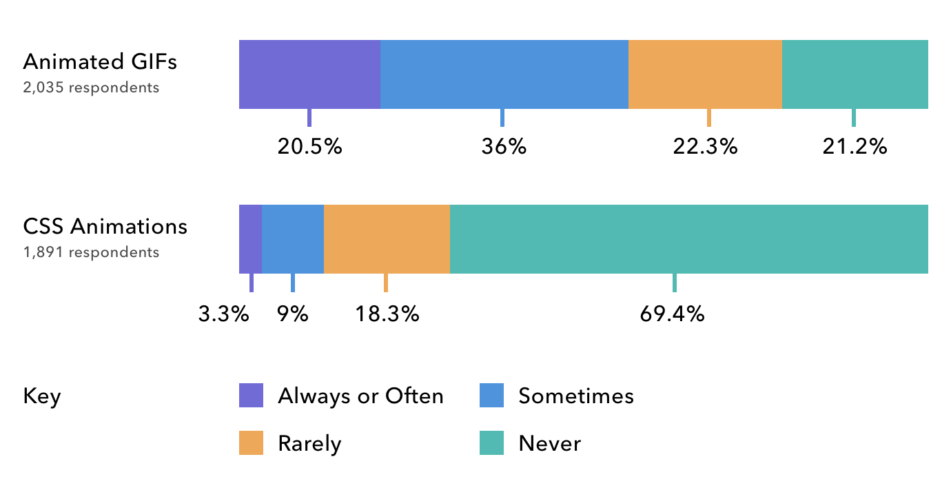
Although animated GIFs have wider support, CSS animations have a number of benefits when used properly.
One of the biggest benefits of CSS animations is that they create faster loading emails compared to using an animated GIF. As more and more emails are read on mobile, email marketers need to contend with subscribers using limited bandwidth and small data plans. Animated GIFs tend to be on the heavier side when it comes to file weights, and can be slow to load and display on mobile devices. CSS animations, however, are code. Being text-based, they are quick to load and play smoothly on most modern devices. They are a great way to create an engaging user experience without cutting into users’ expensive data plans.
Perhaps the most important benefit of using CSS animations is that they allow you to create more interactive experiences for subscribers. Since CSS animations can be tied to specific user behaviors—like hovering over a CTA or tapping on an element in an email—they can be used to cycle through content and different visual states of a campaign.
Although CSS animations use only a few core CSS properties, those properties can be used to create extremely powerful and impressive email campaigns.
Two Types of Animation
At the heart of CSS animations are two key concepts: transitions and keyframe animations. Using these two concepts, you can create everything from a simple hover effect on buttons to more complex animations that are triggered in an interactive email.
Transitions
CSS transitions do exactly what the name implies: They transition an element from one state to another, animating that element in the process. The best way to understand a CSS transition is by looking at an example.
Let’s say we have a call-to-action button with a simple hover effect that switches between two background colors.
See the Pen CSS Animations in Email: Example 1 by Jason Rodriguez (@rodriguezcommaj) on CodePen.
You can see in the CSS that there are two states to the button. The normal one and the :hover state that swaps those background colors. By applying the CSS transition property to the default button state, we can add a nice transitional animation between the two states:
See the Pen CSS Animations in Email: Example 2 by Jason Rodriguez (@rodriguezcommaj) on CodePen.
The transition property takes a few values including the property, timing, and easing function properties to determine how the animation plays. In our example, the transition property is set to all, which will animate every CSS property on that element. The timing is set to 0.6s (seconds) so that it doesn’t take too long and feel sluggish, and the easing function is set to ease, which will—naturally—ease the animation in and out.
What’s cool about CSS transitions is that they can be combined with other CSS properties to create some really interesting effects. If we wanted to draw even more attention to our CTA, we could add two additional CSS properties—box-shadow and transform—to give the button a 3D appearance.
See the Pen CSS Animations in Email: Example 3 by Jason Rodriguez (@rodriguezcommaj) on CodePen.
The beauty of CSS transitions is that they are so simple. With just one line of code, you can beautifully animated between two states. And, when combined with all of the other cool stuff CSS can do these days, you can create email magic.
Check out some of these resources to learn more about what can be accomplished with CSS transitions:
- CSS Transition documentation (Mozilla Developer Network)
- Using CSS Transitions (Mozilla Developer Network)
- All You Need to Know About CSS Transitions (Alex Maccaw)
- CSS Transitions and Transforms for Beginners (Rachel Cope)
Keyframe Animations
Did you ever make a flipbook out of a pad of Post-It Notes when you were a kid? Remember how flipping through your drawings let you create your own little movie? CSS keyframe animations work in the same way. Instead of drawing each individual frame, you can use code to set up the individual “pages” or “frames” for an animation and rely on CSS to animated between those frames. Keyframe animations are a bit more complex than transitions, but that complexity comes with more power, too.
Again, the best way to understand keyframe animations is by looking at an example.
See the Pen CSS Animations in Email: Example 4 by Jason Rodriguez (@rodriguezcommaj) on CodePen.
In the above example, I have a mock email that will need to be scrolled on a mobile device. To encourage that scrolling, I added an arrow that uses keyframe animations to gently bounce up and down. While the same thing could be accomplished with an animated GIF, it was much quicker to use code to build out that motion.
The first step in building a CSS keyframe animation is to define the animation with the @keyframes rule. You need to add a name with which to later reference that animation. In this case, I called it bobbing, since that’s exactly what the arrow is doing.
Within that CSS rule, I set up two frames in the animation: from and to. The first—from—is the initial state of the animation and uses the transform property without any real values to mark the beginning location of the arrow. The second frame—to—is the ending location. Again, using transform, I moved the location of the arrow 60 pixels lower.
You can build more complex frame-based animations by swapping out the from and to keywords with percentages to denote individual frames. For example, if I wanted to have an animation with five frames instead of two, I could add in CSS properties at 20%, 40%, 60%, 80%, and 100%, with each set of properties wrapped in curly braces like in the code above.
Once you have your keyframes set up, you need to initiate the animation. We do this by targeting the HTML element we want to animate and adding the animation property on that element. In the example above, I target a div with the class animate. Within the animation property, you can include a number of values to define the behavior of your animation. These include:
- animation-delay
- animation-direction
- animation-duration
- animation-fill-mode
- animation-iteration-count
- animation-name
- animation-play-state
- animation-timing-function
Not all of them are necessary in every CSS animation you create. In our example, I just use duration, timing function, iteration count, and direction. The duration is counted in seconds (1s) and the timing function is set to ease. Since I want the animation to loop, I set the iteration count to infinite and then reverse the direction upon completion.
There’s a lot that can go into CSS keyframe animation, so I’d suggest digging into the Mozilla Developer Network’s excellent documentation on the subject.
While this is a basic example of CSS keyframe animations, it should hopefully give you an idea of what’s possible in email when you want to move beyond animated GIFs.
Support
Although CSS animations have many benefits, the major downside of using them is limited support in email clients.
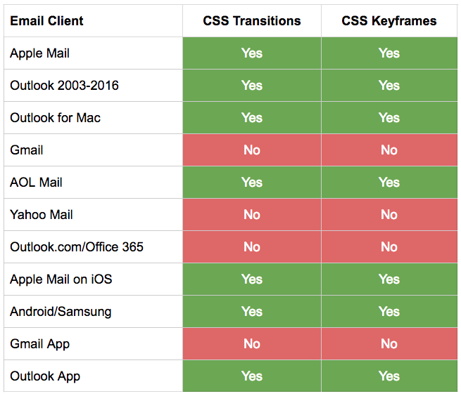
It should also be noted that support comes with a few gotchas, which Justin Khoo has noted in the “Client Specific Quirks” section of his excellent Kinetic Email CSS Support page.
What’s great about CSS animations, though, is that even when they’re not supported, they fall back gracefully. In email clients without support, the HTML elements still display, they just don’t animate. Your email is still functional and can be easily enjoyed by subscribers.
Animation Inspiration
There are a lot of people in the email industry putting CSS animations to use, including Litmus! To get a better idea of what’s possible using CSS animations, we’ve rounded up some of our favorite campaigns:
- Our Litmus Builder launch email, which uses CSS animations to power an interactive product tour
- The original B&Q carousel email, which kickstarted the interactive craze and uses CSS animations to smoothly transition background images
- This Nest product email, which uses a single CSS transition to nicely swap images
- This Sonic The Hedgehog game, which uses CSS animations to power all in-game movement
- This fun PIN puzzle from Camiah, which uses CSS animations to create nice error and success states for each choice in the puzzle
Although some of these emails are more experimental than the typical email marketing campaign, they include ideas that can be incorporated to boost engagement for nearly any industry. All it takes is a little practice, testing, and a sense of adventure.
Test Your Animations with Litmus Builder
Excited to start using CSS animations in your own campaigns? Start creating your next email with Litmus Builder—the only code editor designed for email designers by email designers. Quickly code and preview your emails in 90+ different email clients, save your animations with Snippets and Partials, and upload your campaign directly to your email service provider with ESP Syncing.
The post Understanding CSS Animations in Email: Transitions and Keyframe Animations appeared first on Litmus Software, Inc..