Print and web design doesn’t translate smoothly—or sometimes, at all—to email design.
That’s because:
- Email rendering is much more complex than print and web, and includes the need to consider email image blocking
- Marketing teams have the opportunity for interactive email elements and other progressive enhancements—which have to be balanced with the need for fallbacks to ensure graceful degradation
- Email attention spans are short because it’s generally just a gateway to a landing page where conversions and longer interactions happen
Brand style guides tend to meticulously detail permissible fonts, header sizes, image styles, logo sizes and placements, and more in order to create consistency in brand look and feel. However, despite the clearly unique considerations of the channel, many companies don’t have any email-specific guidance in their brand guidelines.
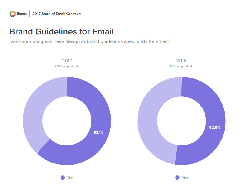
Nearly 38% of brands don’t have email brand guidelines, according to Litmus’ upcoming 2017 State of Email Creative report, which is based on a survey of more than 3,500 marketers.
“Marketers leverage a wide array of resources to produce email messages, the majority of those lacking in-depth email production knowledge or experience,” says Lynn Baus, VP of Digital Experience at Shaw + Scott. “Yet too few brands have invested in email-specific style documents.”
Thankfully, more brands are seeing the need to add email-specific content to their style guides, with 18% more brands creating email brand guidelines since 2016. That’s with good reason.
Having email brand guidelines makes creating emails easier and faster, particularly in organizations with distributed email programs or that use email agencies or freelancers. Marketers who describe their email programs as successful are 22% more likely that those at less successful programs to have brand guidelines for email (67% vs. 55%).
“If a marketer is not prepared—with scattered or missing documentation, and process or expertise gaps—it’s worth investing in building a design system consisting of the templates, style guides, pattern libraries, and more,” says Baus. “This should include not only the elements of design, but the context of the creative pieces and tools necessary to execute on the strategy.”
What to Include in Your Email Brand Guidelines
Every brand has unique needs, but here is a list of elements that you’ll likely want to include in your email brand guidelines:
TEXT
Envelope copy. This copy appears in the inbox before a subscriber opens one of your emails. It includes your sender name, subject line, and preview text—all of which you’d probably want to set some content and tone guidelines around.
For instance, are there any rare circumstances under which you’d want to use something other than your standard sender name? Should your brand use emojis in its subject lines? Do you use the zero-width non-joiner preview text hack to create white space at the end of your intended preview text?
Graphical vs. HTML text. The chances are pretty much 100% that your brand font isn’t a universally supported web safe font. Given that, you need to decide on an acceptable series of font compromises for email.
“Ideally, you’d want to pick either a web font or Google Font as your first choice for an email font,” says Logan Sandrock Baird, Design Services Lead at Emma, “but you should always also include a web safe system font as an alternative for headlines and body copy.”
You’ll also want to determine if there are ever scenarios when you’re unwilling to compromise on your brand or campaign fonts, which you’d have to use as graphical text in an image and risk image blocking making that text not show up.
ALT text. Relatedly, your email brand guidelines should specify your brand’s approach to ALT text for your images, as well as other ways that your web accessibility principles should be translated to email.
For instance, should an image’s ALT text always replicate any graphical text in the image? Do you use ALT for icons (if only a single letter)? When should images not have ALT text?
Avoid ALT text that is redundant with live text in the email, and don’t use ALT text that doesn’t add value or context. For example, using “Photo of a sunset” as ALT text may describe the image, but it isn’t helpful to the subscriber.
Your guidance should be even more specific if your brand is using styled ALT text, which is significantly underutilized. While not universally supported by email clients, ALT text font, color, size, style, and weight can be styled using inline CSS to create a much more compelling images-off emails.
 |
Optimize Your Emails for Images-OffPreview your emails with images blocked and see if any of your images are missing ALT text with Litmus Checklist. |
Tone. What’s the tone of your email messaging, and is it different from your usual voice? It may need to be.
“In email, marketers need to address the general lack of brand context and the lower attention span typical of the inbox experience,” says Katya Hoogerhuis, Associate Creative Director at Shaw + Scott.
Plain-text version styling. Is the plain-text version of your HTML emails auto-generated by your email service provider? If so, what styling and content edits need to be made? If it’s not auto-generated, what’s the procedure for manually creating it and how is it styled?
IMAGES
Web page load times are critical to performance, and email load times are just as important. They’re affected by the combination of image type, image size, and image resolution.
Image type. PNG, GIF, or JPEG? Which is the best image format for email? The answer will change depending on the subject of your images, the overall content of your emails, and other factors.
If your brand uses animated GIFs, you’ll want to include specific guidelines about those, such as maximum file size and how to deal with the lack of animated GIF support in Outlook.

Images sizes for standard positions, such as featured image, secondary images, and thumbnails in a product grid. Because of the need to retina-optimize your images so they look sharp on high-DPI screens, you’ll also want to stipulate…
Image resolution. As we explain in our Guide to Understanding Retina Images in HTML Emails, you’ll want to save your images at double the height and width intended and then specify that intended size in the image tag. For instance, if you wanted an image to appear at 200×200 pixels in the email, you’d save the image at 400×400 pixels.
However, there may be instances when you sacrifice a little image sharpness in exchange for faster image load times. You’ll want to stipulate when to make that tradeoff.
Image style. Do your images have rounded corners? Drop shadows? Your email brand guidelines should clarify how the various images in your emails should be composed and styled.
Logo. Arguably the most important image in your email, your logo may need to be adjusted to be optimized for email. Whatever your guidelines for your logo in email, we highly recommend that you code your logo into your emails as a partial. This doesn’t only guarantee that your logo looks the same across all messages, but also gives you the ability to easily and quickly update your logo across all your emails.
CALLS-TO-ACTION
Chances are that your brand style guide has many variations of image-based and <button> code-based buttons for the web—none of which should ever be used in an email because of image blocking and coding support issues. Instead, you should be using…
Bulletproof buttons. Your email brand guidelines should include code snippets for all of the various styles of bulletproof buttons that you need for your emails.
CTA hierarchy. All calls-to-action shouldn’t have equal weight. How do you differentiate primary CTAs from secondary CTAs, and secondary CTAs from tertiary CTAs? Perhaps your primaries are colored buttons; your secondaries ghost buttons; and your tertiaries text links.
CTA language. Include a library of standard language for your CTAs. For instance, do your product CTAs say “Buy Now,” “Shop Now,” or “Learn More”? Should your CTAs vary by subscriber segment (e.g., prospect vs. customer)?
FREQUENTLY USED CONTENT
In addition to your logo and buttons, marketers should have a library of other frequently used assets at their fingertips to speed up email creation.
“Excuse my language, but your email brand guidelines should give a F.U.C.,” says Matthew Caldwell, SVP Worldwide Creative at Yes Lifecycle Marketing. “That stands for Frequently Used Content.”
Yours should include language, images, and other assets for:
- Email headers
- Email footers (including unsubscribe links)
- Navigation bars
- Guarantees
- Disclaimers
- Taglines
- Product descriptions
- Value propositions, bullet points, etc.
- Mobile app and social media promotions
- Icons
- And anything else you want to be standardized
PERSONALIZATION & DYNAMIC CONTENT
The flipside of frequently used content is personalized content, which will vary from email to email depending upon who the subscriber is.
“How are simple dynamic elements such as text or individual graphics treated?” asks DeeDee Flagg, Director Digital Development at Shaw + Scott. “It’s preferable to include examples or references in your email brand guidelines so it’s clear how it should look.”
Given the rising strategic importance of dynamic content, all brands should be looking to ensure it’s presented in the best possible way and not leave any details to chance.

ENHANCEMENTS & FALLBACKS
Trying to create a totally consistent email experience for all subscribers is a losing strategy, because it means you’re playing down to the lowest common denominator in terms of email client functionality.
Instead, marketers need to look for opportunities to give some of your subscribers better experiences by using progressive enhancement techniques that provide improved rendering or advanced functionality in certain email environments. However, that approach creates the need for fallbacks for when coding isn’t supported to ensure an adequate baseline experience.
“Understanding the relevant customer use cases in which emails are typically viewed helps resources focus their energy on designing the best message for a specific audience and set expectations with their stakeholders who may not represent the subscribers’ use cases,” says Katya Hoogerhuis, Associate Creative Director at Shaw + Scott. “For example, iOS viewers will be able to experience more complex enhancements in an email, whereas Outlook will strip out a lot of those enhancements.”
TEMPLATES, MODULE USAGE, & BREAKOUT DESIGNS
Templates. Your email brand guidelines should include which email templates should be used for which emails. That said, brands are increasingly using a universal email template that’s endlessly scalable and flexible to create all their emails. If that’s the case with your brand, then be sure your email brand guidelines include…
Module Mix and Match Examples. “Many brands use modules and other standardized content blocks to construct emails,” says Caldwell. “So include a variety of examples of how these can be used to make vastly different emails from short to long.”
Breakout Designs. Consistency is great, but there’s a lot to be gained from occasionally deviating from your usual creative. Breakout design can send a signal to your subscribers that an email’s message is extra special and that they should pay extra attention to it this time.
Your email brand guidelines should specify when breakout designs should be used. For example, 52% of brands use one-off email designs for key seasonal campaigns, according to Litmus’ 2017 State of Email Creative.

“We have tactics like ‘turn of top header’ and others that make a splash and look different,” says Caldwell. “We know we’ll need this tactic so we set rules upon when it can be used—for example, for new product introductions or for twice-a-year sales only.”
The Biggest Challenges with Email Brand Guidelines
Creating email brand guidelines can be difficult. Keeping them up to date can also be a challenge. But if they’re not current then they’re not serving their purpose fully and helping your team easily, efficiently, and consistently build emails.
“We have found a good system is to plan for two ‘style guide windows’ per year,” says Caldwell. “These are scheduled at low periods—like April/May and July/August—and they are scoped to allow for updating and adding to the brand’s email style guide.”
Another major challenge is how email brand guidelines are distributed.
“Often the style guides are designed as print pieces and only exist in digital format as a PDF,” says Baus. “As a result, legacy PDFs remain in distribution long after updates are made, which causes confusion. To avoid this problem, some brands have moved to web-based guides that live behind a log-in. This format is easier to update and helps to ensure that legacy information is taken out of active circulation as it’s retired.”
Living without Email Brand Guidelines
Don’t have a style guide for email and there’s no chance you’re going to get one soon? So long as your brand is prepared to be flexible and forgive inconsistencies, it may not be a big problem.
“I actually don’t think there should be email-specific brand guidelines,” says Alex Williams, VP of Creative Director of Trendline Interactive. “Email teams should just be able to use everything available in brand guidelines, which tend to include secondary accent colors and nuances of voice and tone. Email teams just need to be able to stretch the brand to those edges.”
Williams added, “I’ve always believed that brands are a vibe—and that email is international waters. If the aesthetic is treated right and the voice and tone is right, email is the ultimate channel to experiment with messaging and creative.”
 |
Email Marketing Leadership SeriesFree one-page, printer-friendly summaries on critical email marketing issues that you can share with the leadership at your company. |
The post Why You Need Email Brand Guidelines and What to Put in Them appeared first on Litmus Software, Inc..